64 Cells –
Infinite Opportunities?
How from a simple 8×8 grid, countless fonts were created during the golden age of arcade games
Text by Monica Lara
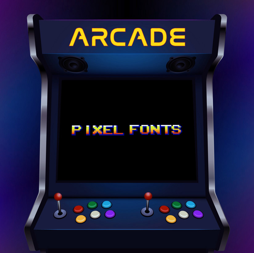
You might be wondering, 64 tiles? 8×8 grid? What does this mean? To answer those questions, we have to go back in time. 1976 is when arcade games started to take over.
© Monica Lara, Fachhochschule Potsdam, 2022
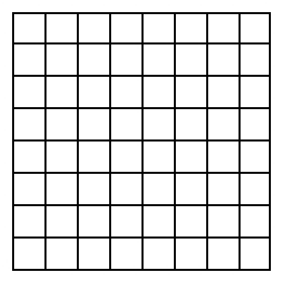
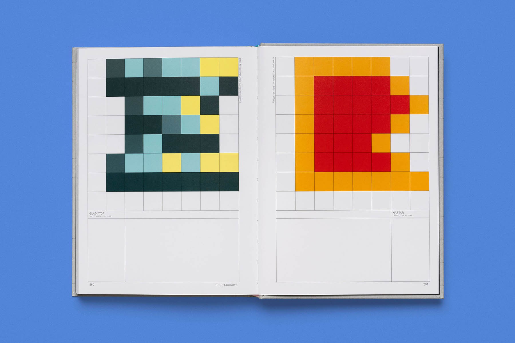
Back then the technology was different from today. There were no HD screens or LCD-based monitors, back then we used to have big machines full of hundreds of circuits and computer chips. The TV monitors display of these early machines was divided into a 32×28 tile grid. Each tile represented 1 byte of data, that equals to 8bits. The 8-bit tile had its own grid, diving the tile into a 8×8 grid. ↘ 1 Arcade Game Typography. The Art of Pixel Type. Book: thamesandhudson.com/arcade-game-typography-9780500021743. Toshi Omagari, Kiyonori Muroga, Thames and Hudson, October 2019 Within this small grid consisting of 64 cells, each cell can be turned on and off. When the cell was on then it was full, which means you could see something – when the cell was turned off then it was blank and there was nothing to see.
© Monica Lara, Fachhochschule Potsdam, 2022
So the more cells that were turned on, the more computer processing power was needed. And back then our computers didn’t have the power that they have now, by today’s standards this would be super constraining. Arcade games looked the way they did because they were trying to balance conserving computer memory and creativity.
Shaping new typographical forms
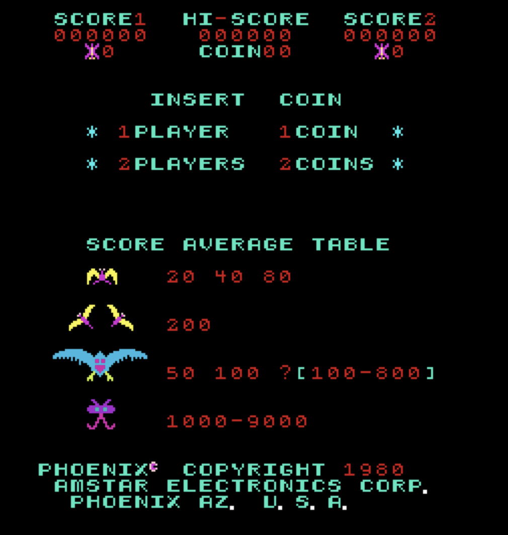
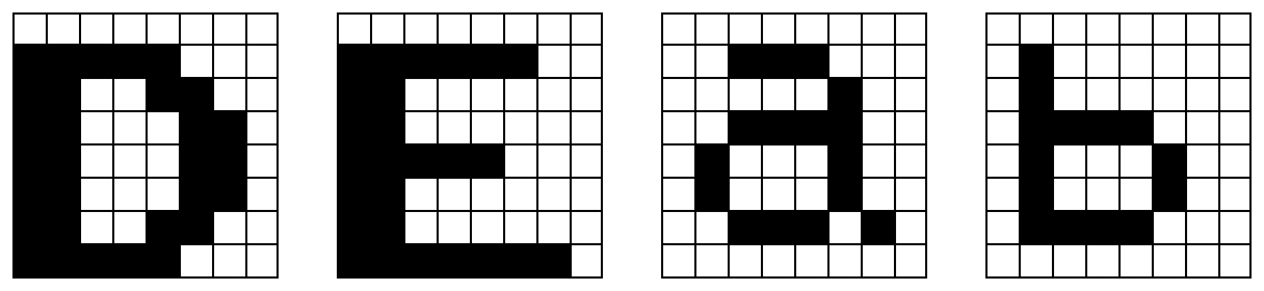
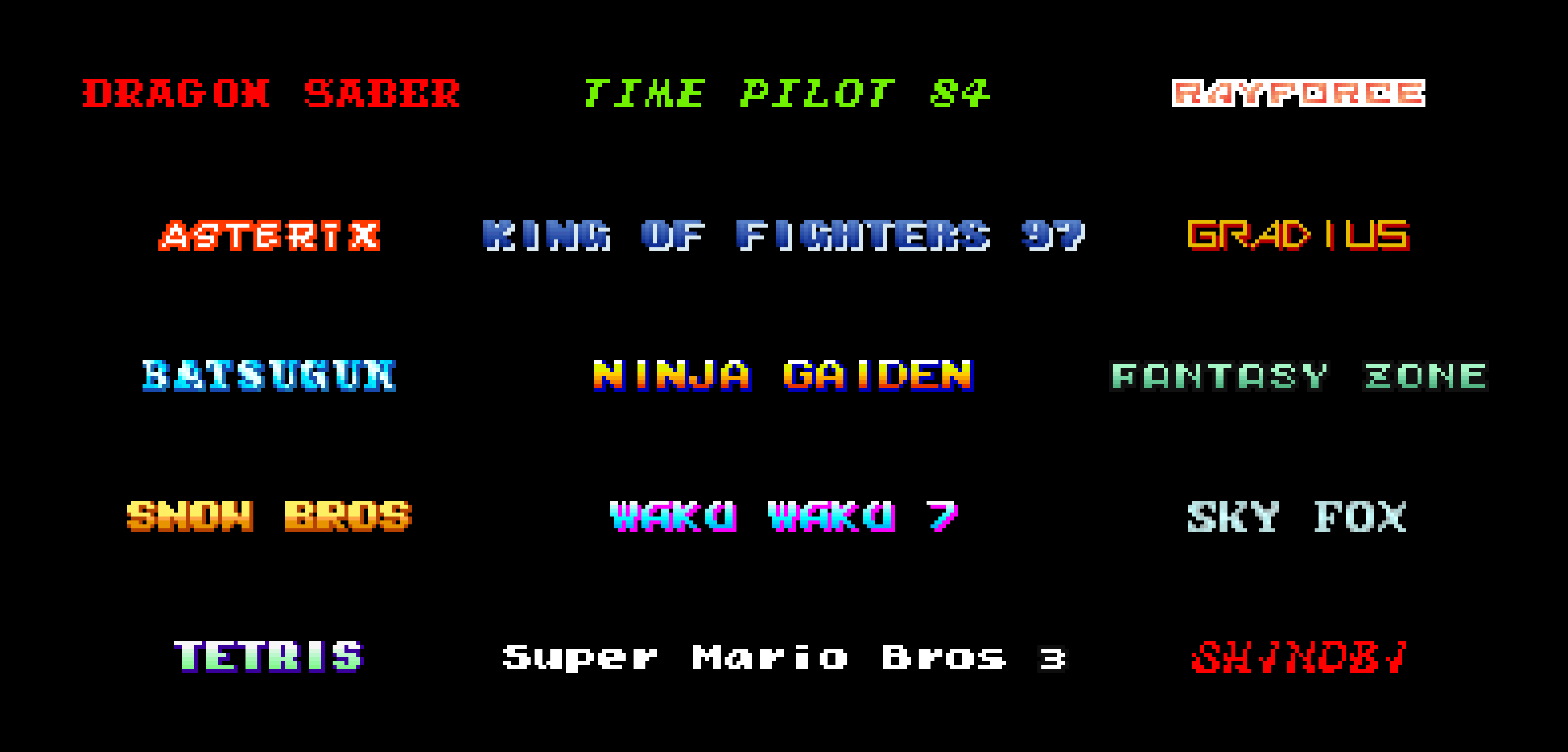
But what about the typography in the games? Most arcade fonts were monospaced. That means that every letter has to have the same width. The problem with this was, that in our 8×8 grid, this gap between letters had to be considered as well. With uppercase letters, there were some challenges while creating them, but they were still “easy” since uppercase letters have the same height.
© Ivan Cerra De Castro, 2018
But lowercase letters had other types of peculiarities. It was difficult to figure out what they were supposed to look like. They were harder to make. Lowercase letters need more space due to the ascenders and descenders. That means that the proportions of these letters in this small closed grid were a bit off.
© Monica Lara, Fachhochschule Potsdam, 2022
To give you an example of how general arcade fonts looked like, we have to go back to where it all started. It was a typeface from Atari, its first appearance was in the Quiz Show game back in 1976. ↘ 2 Kee Games Quiz Show. Article: arcarc.xmission.com/Web%20Archives/Jeff%20Andersen%20%28Sep%2027%202003%29/qs/default.htm. Its proportions were two pixels in vertical thickness and one pixel in horizontal thickness. But what made this font stand out is that the designers of it also attempted to follow the calligraphic tradition of typography. They designed every letter as if it was written with a flat pen. They managed to differentiate the zero from the “O” and gave it some character.
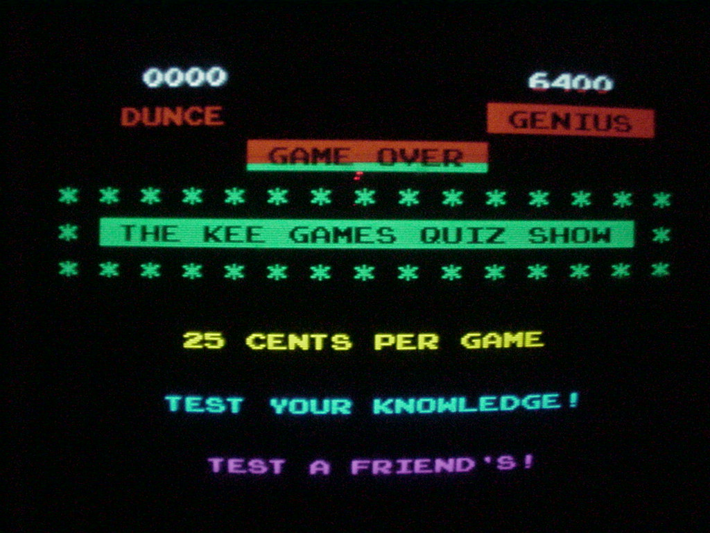
© Jeff Anderson
Creating the art of pixel type
With more advancements in technology and a lot of creativity, arcade game designers managed to fit more and more detail in the 8×8 grid. They added colors, outlines, gradients, and shadows. The fonts got more creative, bolder, and exciting. ↘ 3 The 8-bit arcade font, deconstructed. Video: www.youtube.com/watch?v=C5NiAoT3xsY. Producer: Estelle Caswell, story editor: Bridgett Henwood, featuring: Toshi Omagari, April 2020
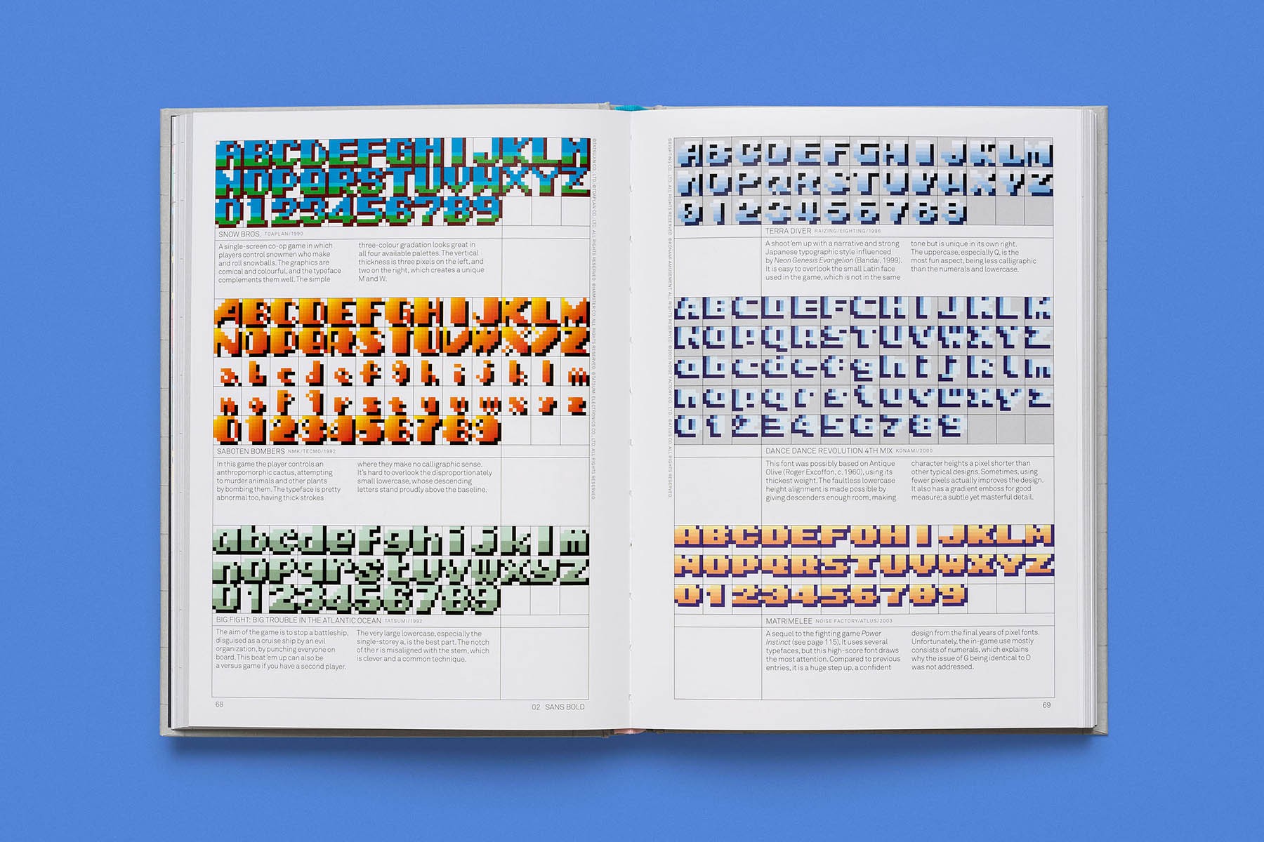
© Read-Only Memory, 2023
© Read-Only Memory, 2023
It all started as a technical challenge, but it quickly became an exercise in creativity and the possibilities became infinite. So next time you play Pac-Man, Tetris, Donkey Kong, or another game from that era: keep in mind what it took to make that font, it is part of our history.
© Monica Lara, Fachhochschule Potsdam, 2022
