Hype or
Future of Type?
Are variable fonts
the future of typography
or a temporary trend from the 2010s?
Text by Marina Ortega Velaz
Variables fonts have been around for a while. In fact, in 1930, Josef Albers designed the Kombinationsschrift based on 3 basic shapes (circle, quarter circle and square) developed from experiments created with templates he made in 1928. ↘ 1 Kombinationssschrift: Article: www.bauhauskooperation.de/wissen/das-bauhaus/werke/druck-und-reklame/kombinationsschrift/. The typeface could be adapted on its width, height or weight and was especially developed for posters and displays. ↘ 2 Albers, Josef (1931): kombinationsschrift „3“, in: bauhaus zeitschrift für gestaltung nr. 1 januar 1931, Dessau.
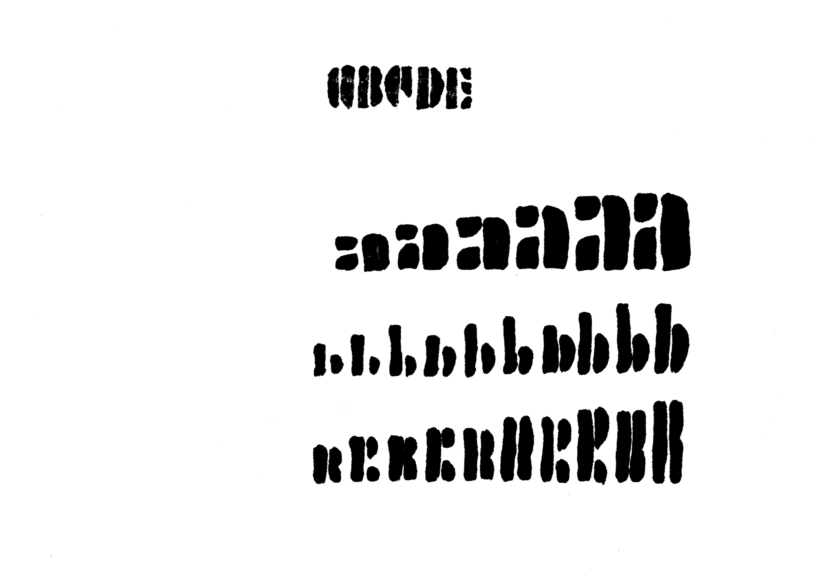
© Tilla Borner, Fachhochschule Potsdam, 2023
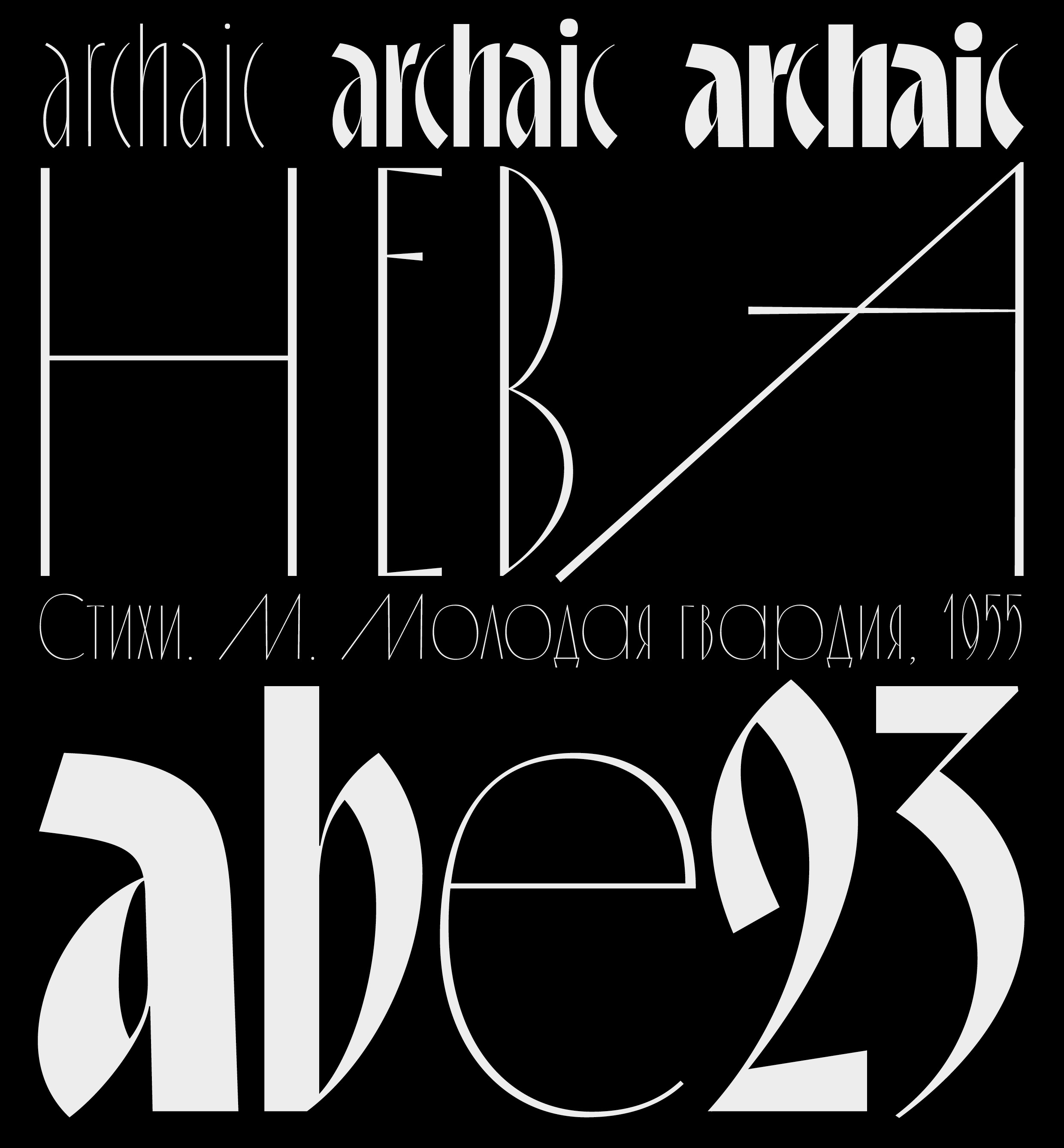
Six decades later, with the evolution of typography and softwares, type designer Luc(as) de Groot created his first Multiple Master Font (currently known as variable fonts, short for OpenType Font Variations). ArrowFont 2.0 was first commercialized in 1992 for a signage company in London. ↘ 3 ArrowFont 2.0 by Luc(as) de Groot: Font: www.lucasfonts.com/learn/arrow-font. By setting its weight and angle, the end user could create up to 18 different arrows of their own.

© Luc(as) de Groot, ArrowFont 2.0, 1992
The major technology revolution arrived in 2016 with the release of version 1.8 of OpenType with its “OpenType Font Variations”, better known as variable fonts amongst many designers. Custom style creation was possible from a single font file, meaning that users could easily choose any typeface weight between two extremes within one font file. ↘ 4 On the road to variable. The flexible future of typography: Book: victionary.com/products/on-the-road-to-variable?variant=35147470700706 In other words, the advancement in OpenType fonts brought a multi-axis design space, within which many fonts can be interpolated with little to no effort. Saved in a single file, they can quickly be made responsive on websites across many different devices (computer, tablet, smartphone). The increased usage of mobile devices in the past 5 years has made it clear that adaptability is an appreciated feature in the digital world. If a font is not able to automatically adjust in size and aspect ratio of the device, it will not be considered an efficient font in terms of digital usage. With all this information in mind, we asked ourselves: how does the technological advancement in variable fonts translate into the design of our times?
New perspectives for today’s design projects
During the Mastering Type Exhibition, organized by the Typostammtisch (Berlin, 2022), brilliant typeface designers presented their latest work. What the next three typeface designers have in common is that they all created variable fonts, which serve different purposes and impact in different ways the current typography and design scene. ↘ 5 Nachbericht 94. Typostammtisch: Ausstellung und Präsentationen Mastering Type: Article: typostammtisch.berlin/2022/05/nachbericht-94-typostammtisch-ausstellung-und-praesentationen-mastering-type/.
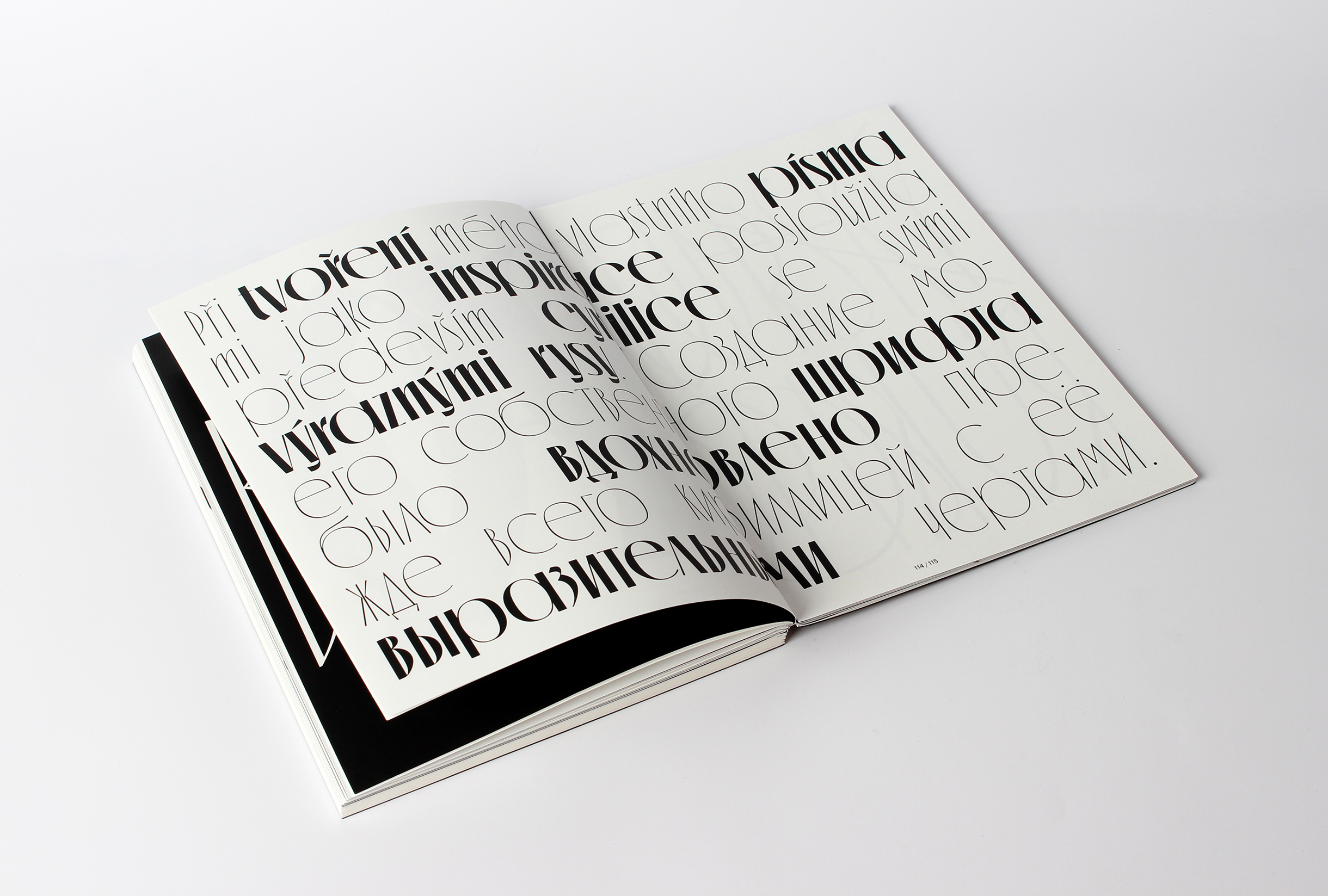
Ilya Bazhanov created the typeface Emigrant (Prague, 2022) and as a result, brought back old fonts to life. As part of his research, he went through archives of newspapers and book covers and collected typefaces that were used at the time. Ilya scanned all different kinds of typefaces that were only used in printed matter back then.

© Ilya Bazhanov, UMPRUM, 2022
Through different combinations of the cuts, he achieved to create a “mix of shape, weights, structure and style”, referencing the diverse social backgrounds of Ukrainian, Belarusian, and Russian emigrants from the first half of the 20th century in Europe. ↘ 6 Nachbericht 94. Typostammtisch: Ausstellung und Präsentationen Mastering Type: Article: typostammtisch.berlin/2022/05/nachbericht-94-typostammtisch-ausstellung-und-praesentationen-mastering-type/. With one of his previous typefaces Thaw, his intention was similar. He aimed to bring back typefaces used in the 60s and give them a contemporary look. This revival made it possible to use the typeface on digital devices and with a broader range of options (change in proportions and dynamics of the text).
© Ilya Bazhanov, FUD UJEP, 2019
© Ilya Bazhanov, FUD UJEP, 2019
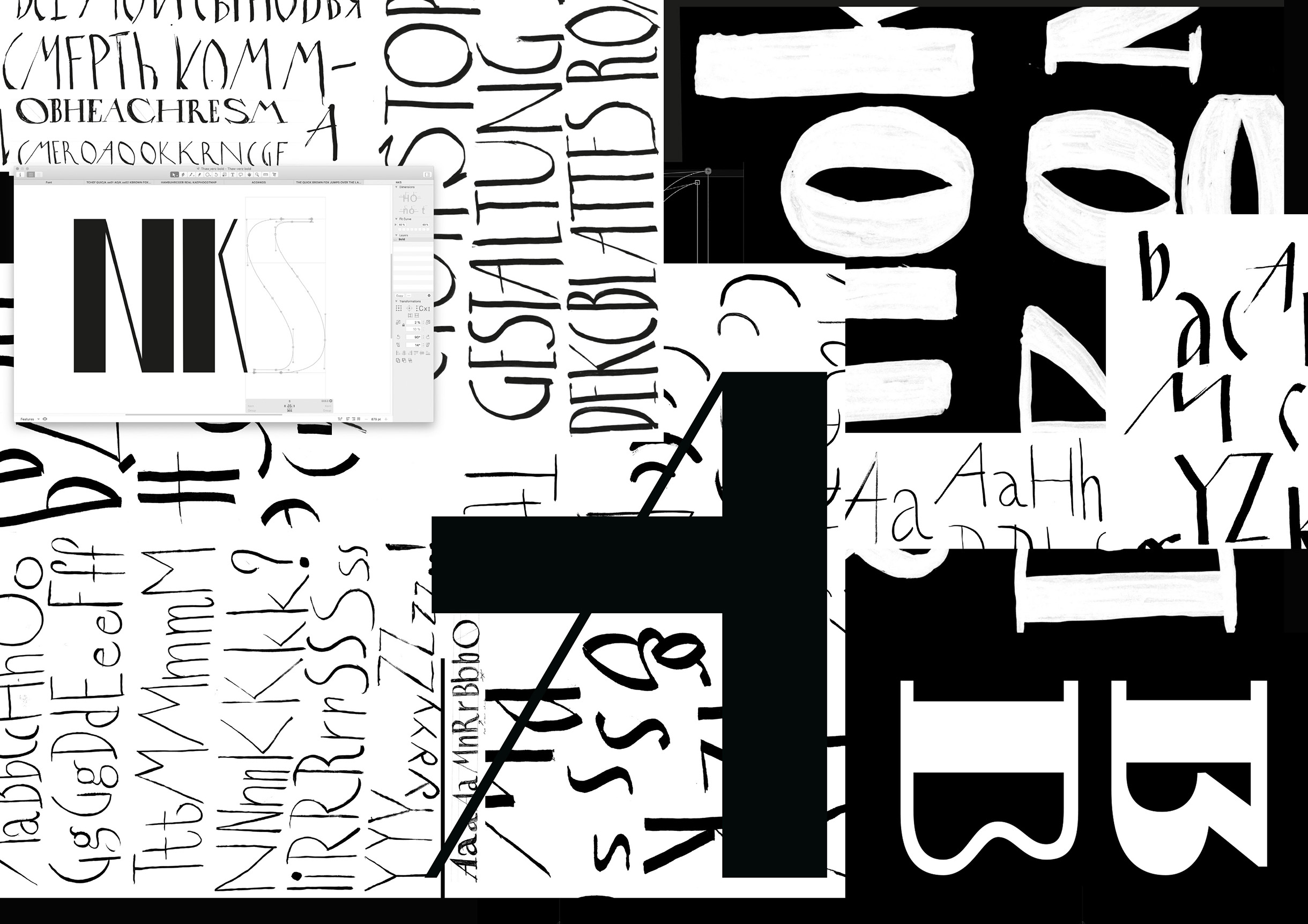
© Ilya Bazhanov, FUD UJEP, 2019
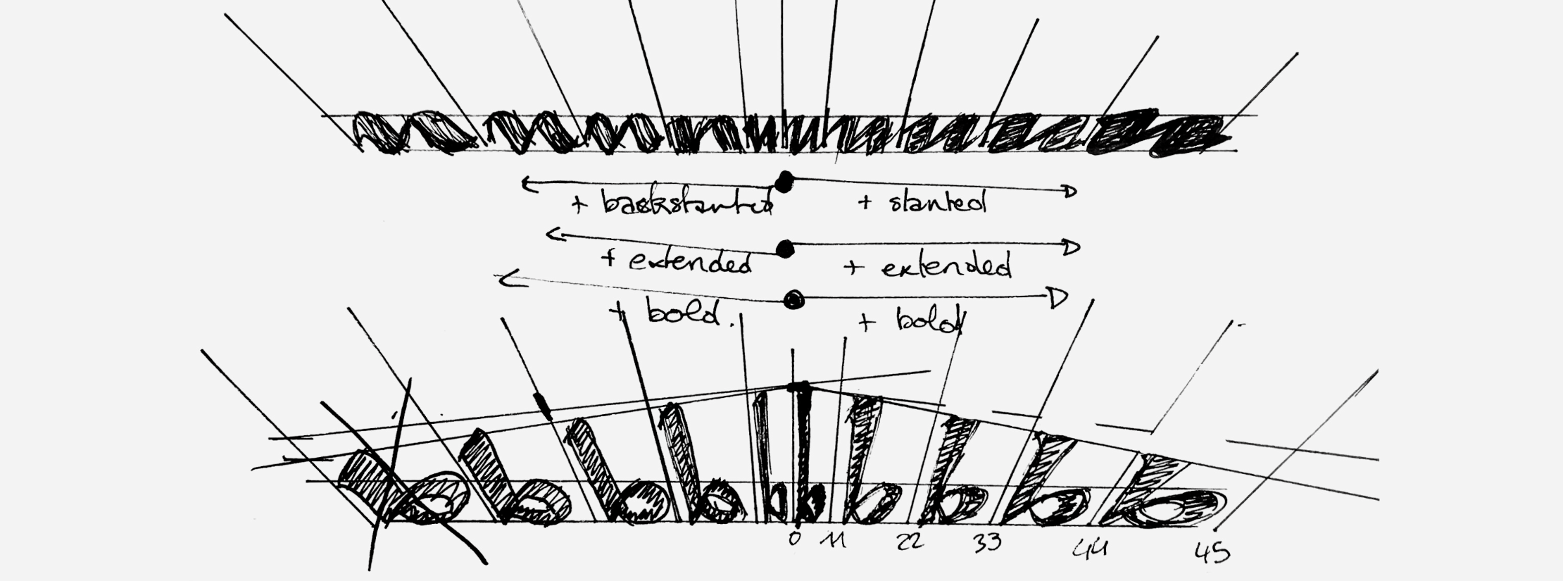
Another interesting aspect of variable fonts was brought by Léna Le Pommelet and her typeface Furya (The Hague, 2021).

© Léna Le Pommelet, Furya, TypeMedia, 2021
Inspired by mechanical style car typography of the 50s to the 70s and their optical illusions, she created a typeface that translated speed into the 2D world. Her speedometer axis connects different axis (weight, width, contrast, and slant from -45° to 45°) and creates an eye-catching typeface, that wraps the viewer in totally new dimensions. ↘ 7 Nachbericht 94. Typostammtisch: Ausstellung und Präsentationen Mastering Type: Article: typostammtisch.berlin/2022/05/nachbericht-94-typostammtisch-ausstellung-und-praesentationen-mastering-type/.
© Léna Le Pommelet, Furya, TypeMedia, 2021
Furya brings a deeper sense of motion and dynamic to the screen in a time where not only opening titles and television advertisements are making use of movement.
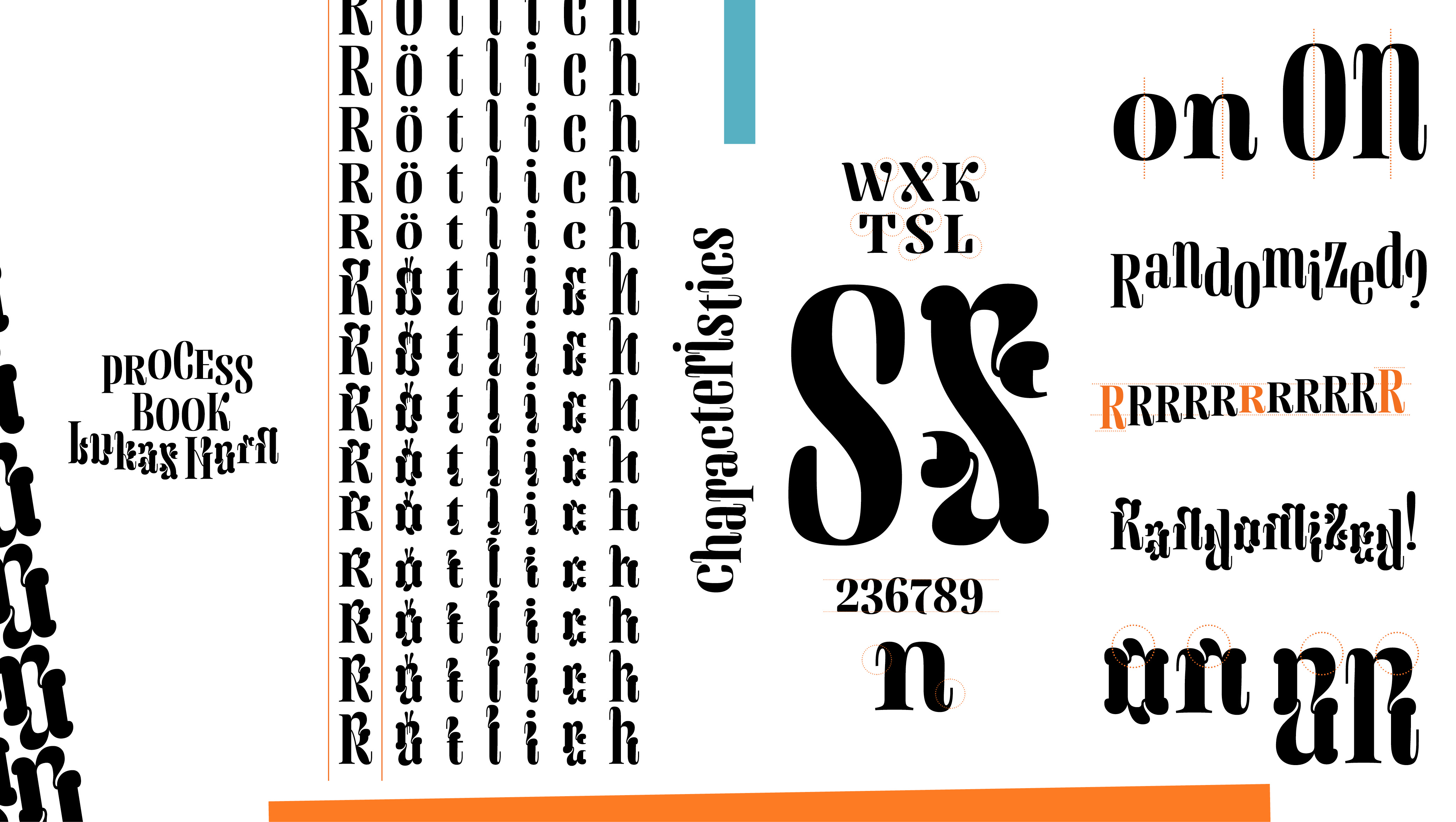
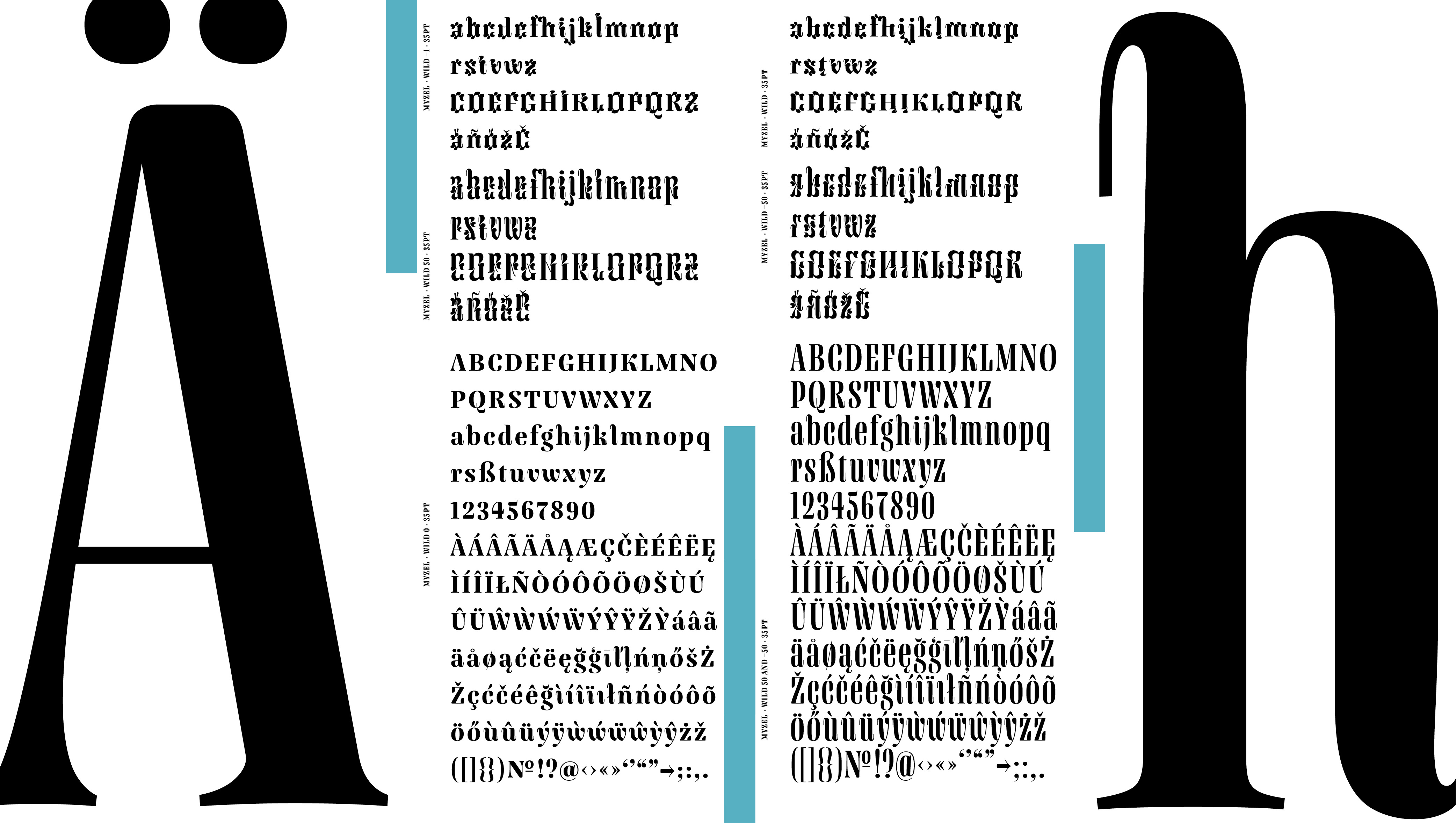
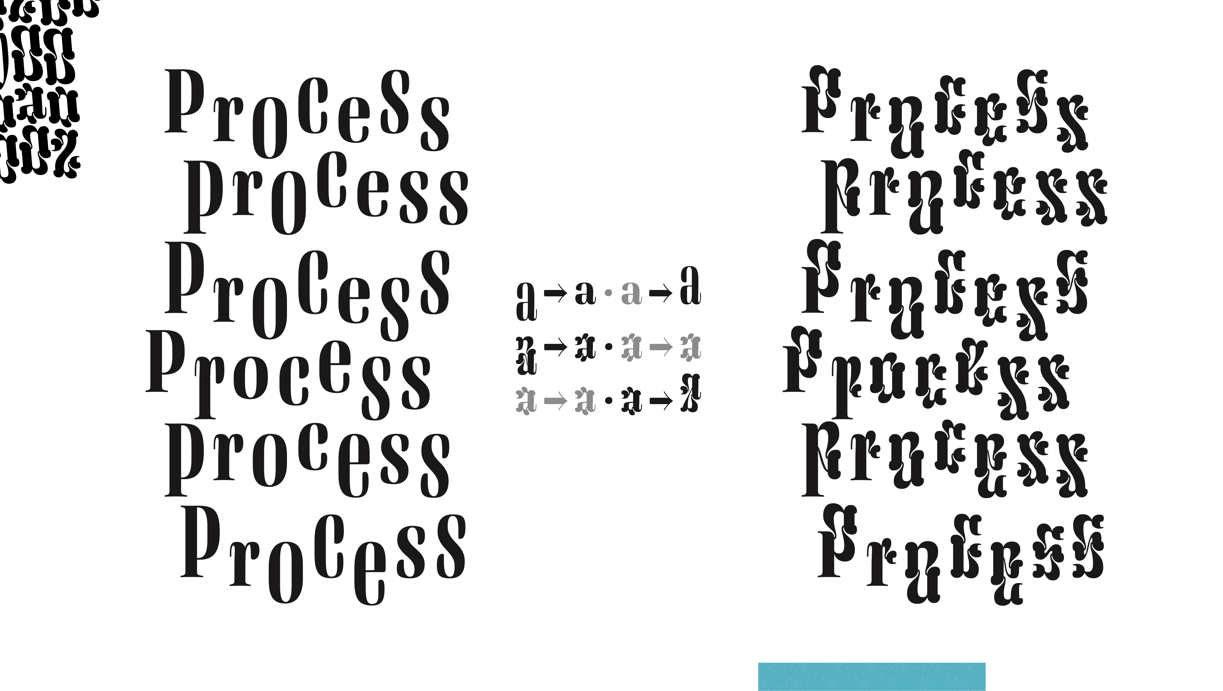
Around the topic of adaptability and responsiveness, Lukas Horn showcases the use of his variable font Myzel (The Hague, 2021) on both, mobile devices and desktops.
© Lukas Horn, Myzel, TypeMedia, 2021
Myzel is the best example of a typeface that works both in its static form, with its ornaments turned into beautiful and aesthetic patterns and its dynamic form. Thanks to advancements in programming languages, such as Javascript and CSS, Lukas was able to give a playful touch to his typeface by considering the different interactions a user can have with the typeface, when used on specific browser versions of a desktop. In a way, this proves the current limits of the technology and the work that is still ahead of designers and programmers.
© Lukas Horn, Myzel, TypeMedia, 2021
© Lukas Horn, Myzel, TypeMedia, 2021
Through the examples mentioned previously and the work shared online by many other designers, we have noticed how variable fonts have been shaping the design of the past decade drifting to more dynamic, playful, and interactive creations. However, the contribution of the OpenType Font Variations technology is not stopping here. Designers and font developers are still working on making the technology available on as many browsers and software as possible. ↘ 8 Variable fonts: What’s new in them for designers? Video: www.youtube.com/watch?v=YVu_a97E8qk. Producer: TypeType, Speakers: TypeType font foundry team, April 2021.
We are curious to see what kind of results will be achieved with the future development of variable fonts when used for purposes that go beyond design, and what new dimensions the technology will bring to the design landscape of the future.
