Letters with
Stories to Tell
On the tracks of
East German
typography
Text by Clarissa Lütz
The city is teeming with type. All around us neon signs, illuminated letters, handwritten offer boards, plain letters carved in stone or playful curved store signs are flashing. The design of these publicly visible letterings also tell stories about the places themselves: who is being targeted here, how exclusive is this neighborhood, and what do they reveal about the area’s past?
This article takes you on a walk through the history of a very specific street in Berlin: the Karl-Marx-Allee. The socialist boulevard of the GDR, which stretches from Frankfurter Tor to Alexanderplatz, still catches the eye today with its monumental, neoclassical listed architecture. But it’s not just the buildings that remain today, some of the original signage adorning signs from the period before the fall of the Berlin Wall, storefronts, or movie theaters along the street are also still intact. Some of the places to which the inscriptions refer still exist today, others have given way to new uses. In the design of these writings, a piece of city history can also be told. They not only lead to historically interesting places but also reflect the socialist approach to consumption, advertising, and architecture.
Typography in the GDR
In the GDR, there were three production sites for typography: Dresdner Schriftguß AG, Schelter & Giesecke, and Ludwig Wagner from Leipzig, which merged into VEB Typoart in the 1950s to 1960s in the course of the nationalization of these companies. After the Second World War, about two-thirds of the typeface stock had been destroyed and the company initially returned to the typefaces of the 1930s that had not been used under National Socialism, such as Super Grotesk, which had been developed and licensed by Arno Drescher in Leipzig. ↘ 1 Super Grotesk, Maxima & Co. Interview: www.kulturrat.de/themen/heimat/ost-west-perspektiven/super-grotesk-maxima-co/. The type designers of the GDR also followed international typographic developments, sometimes even traveling to capitalist countries to acquire licenses or templates. However, some licenses, such as for the Swiss Helvetica, were simply too expensive, which is why they began to develop new typefaces following the modern zeitgeist. This is how the typeface Maxima was created in the 1960s, which was to become VEB Typoart’s largest extended font family. Due to the shortage of paper, there were precisely defined instructions for print runs as to what percentage of the paper had to be printed. Such specifications were also reflected in typographic development, such as in the typeface Minima developed by Karl-Heinz Lange, which was optimized for very large amounts of text on as few pages as possible and was intended to be legible even on poor paper. After reunification, VEB Typoart was sold by the Treuhand to Karl Holzer from West Berlin, who, however, was more interested in the real estate than in the value of the GDR typeface. After the company went bankrupt in the 1990s, he did not care about the whereabouts of the typefaces and their licenses. Some of the original drawings and lead types are now owned by the Museum für Druckkunst and the Hochschule für Grafik und Buchkunst Leipzig. The rights to some of the typefaces were acquired by former VEB type designers and are still largely in use today. ↘ 2 Super Grotesk, Maxima & Co. Interview: www.kulturrat.de/themen/heimat/ost-west-perspektiven/super-grotesk-maxima-co/.
The Urania World Clock
As the conclusion of the extensive redesign measures on Alexanderplatz in the sense of socialist modernism, the Urania World Clock was inaugurated in 1969.
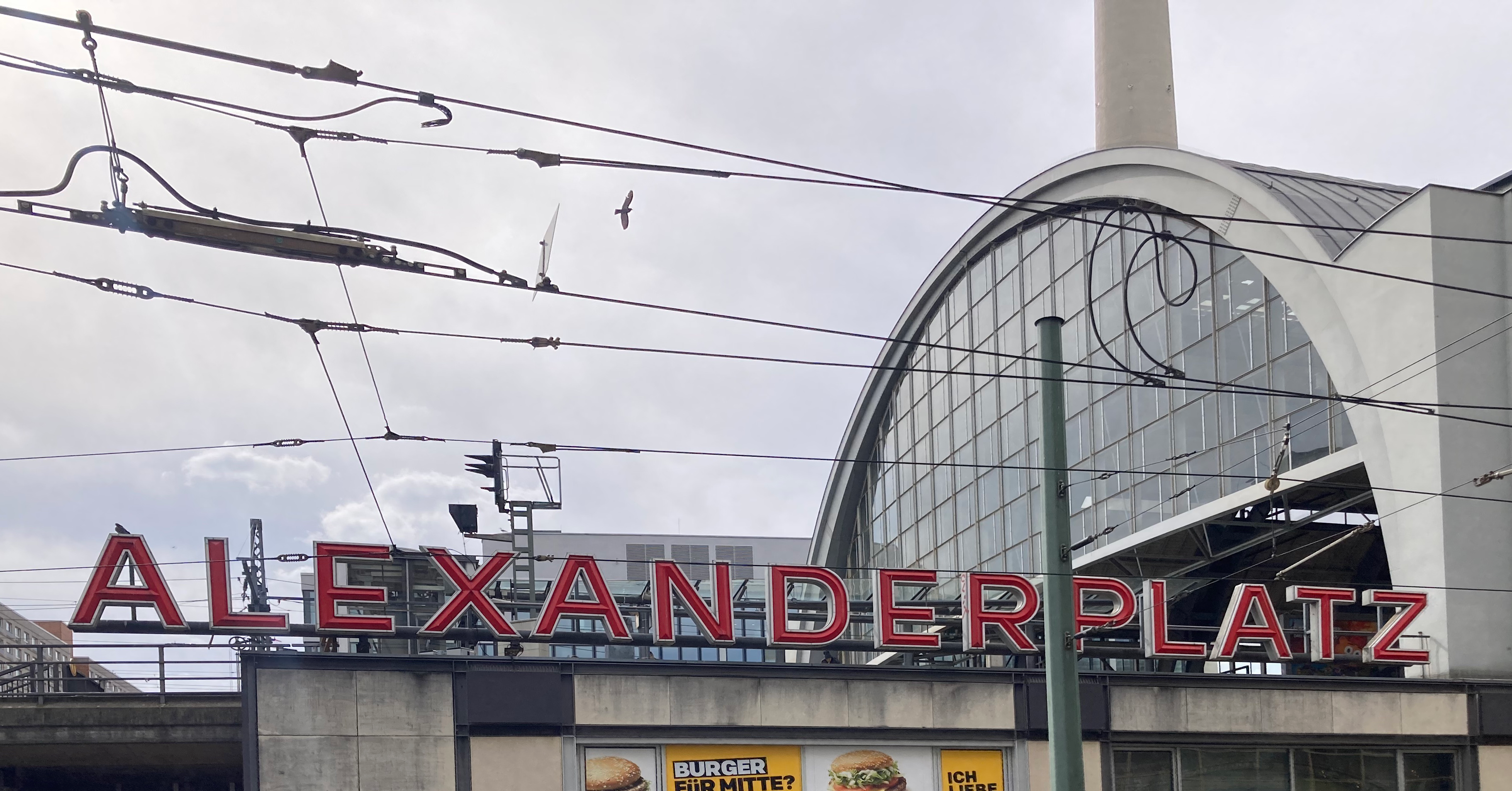
© Clarissa Lütz, Fachhochschule Potsdam, 2023
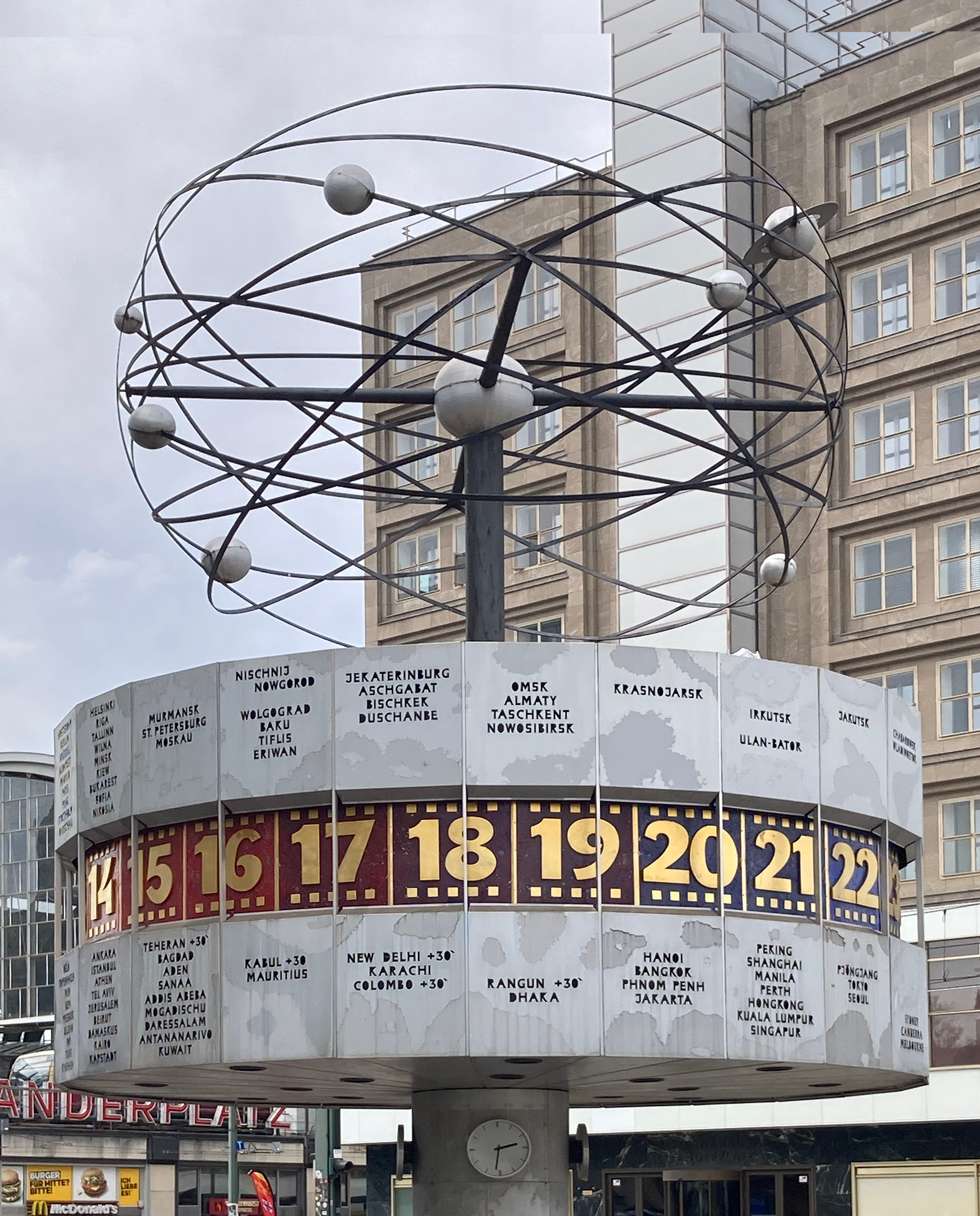
On the large cylinder, the most important city names of the 24 time zones are arranged in columns, above which the hour ring rotates.
© Clarissa Lütz, Fachhochschule Potsdam, 2023
However, today it does not quite correspond to the original: in the 1990s, some city names were added or adapted - for example, the city of Leningrad became Saint Petersburg. They are milled into the aluminum, so only the outlines of the plain static capitals are visible. The counters are entirely recessed, making the “O’s” appear like oval holes. In contrast, the large gold numerals of the hour ring are raised and protrude slightly. They are much more playful, almost dynamically designed, and show a higher stroke contrast.
Kino International
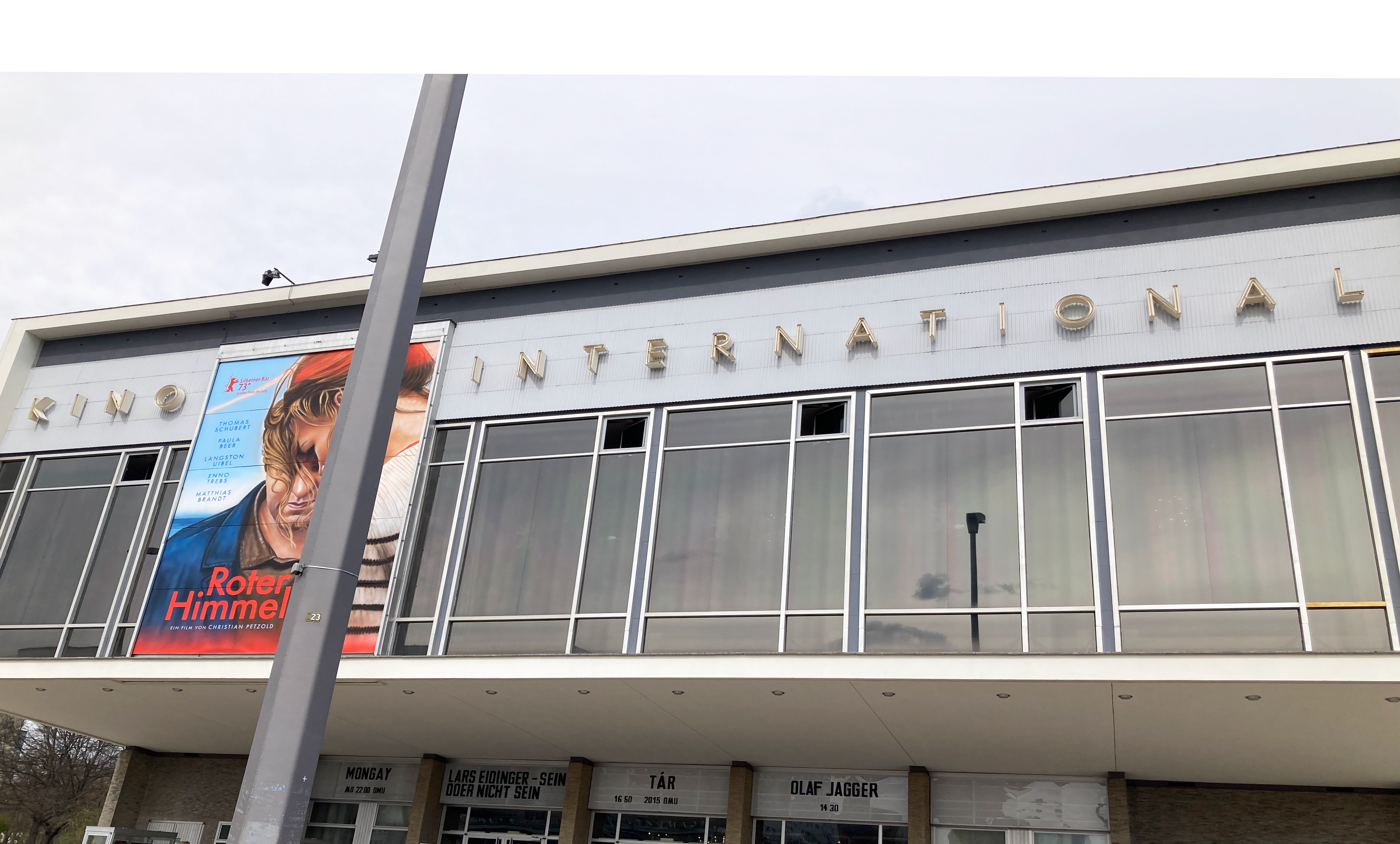
Whereas in the early section of Karl-Marx-Allee in the 1950s, the focus was on neoclassical workers’ palaces, which you will encounter later on your walk, here in the second construction phase, the focus was on modern, functional prefabricated housing. On the one hand, this was intended to create inexpensive living space, and on the other hand, it was an attempt to distance oneself from the Stalinist building tradition, which was no longer desirable. The Kino International, the premiere cinema of the GDR on Karl-Marx-Allee 33, was to serve as the cultural center of the new residential quarter with a library, club, and sports rooms.
© Clarissa Lütz, Fachhochschule Potsdam, 2023
Above the glass front of the projecting main facade is the lettering “Kino International”. In a simple sans-serif geometric capital font with a very high running width, the clarity and modern orientation of the building are also taken up in the typography. The lettering is designed in neon letters that stand out strongly against the wall. ↘ 3 DDR-Archigrafie. Article: www.moderne-regional.de/fachbeitrag-baubezogene-schrift-in-der-ddr/.
Café Sibylle
In the 1960s, Café Sibylle opened here at Karl-Marx-Allee 72. It was named after the GDR fashion magazine “Sibylle”, which held its fashion shows and editor’s meetings here. With occasional interruptions, it has been open ever since. Today it also houses a permanent exhibition on the history of Karl-Marx-Allee. The café’s sign immediately catches the eye - due to the yellow neon lettering that glows even in daylight, but also due to the unusual typography.

© Clarissa Lütz, Fachhochschule Potsdam, 2023
It’s unclear whether the text is written in handwriting or a geometric script. On one hand, the word “Café” has a sweeping “C” and connected letters, while the “ll” is also sweeping. On the other hand, the circular counter of the “b” and the endings of the two “e” suggest a geometric script.
Karl-Marx-Buchladen
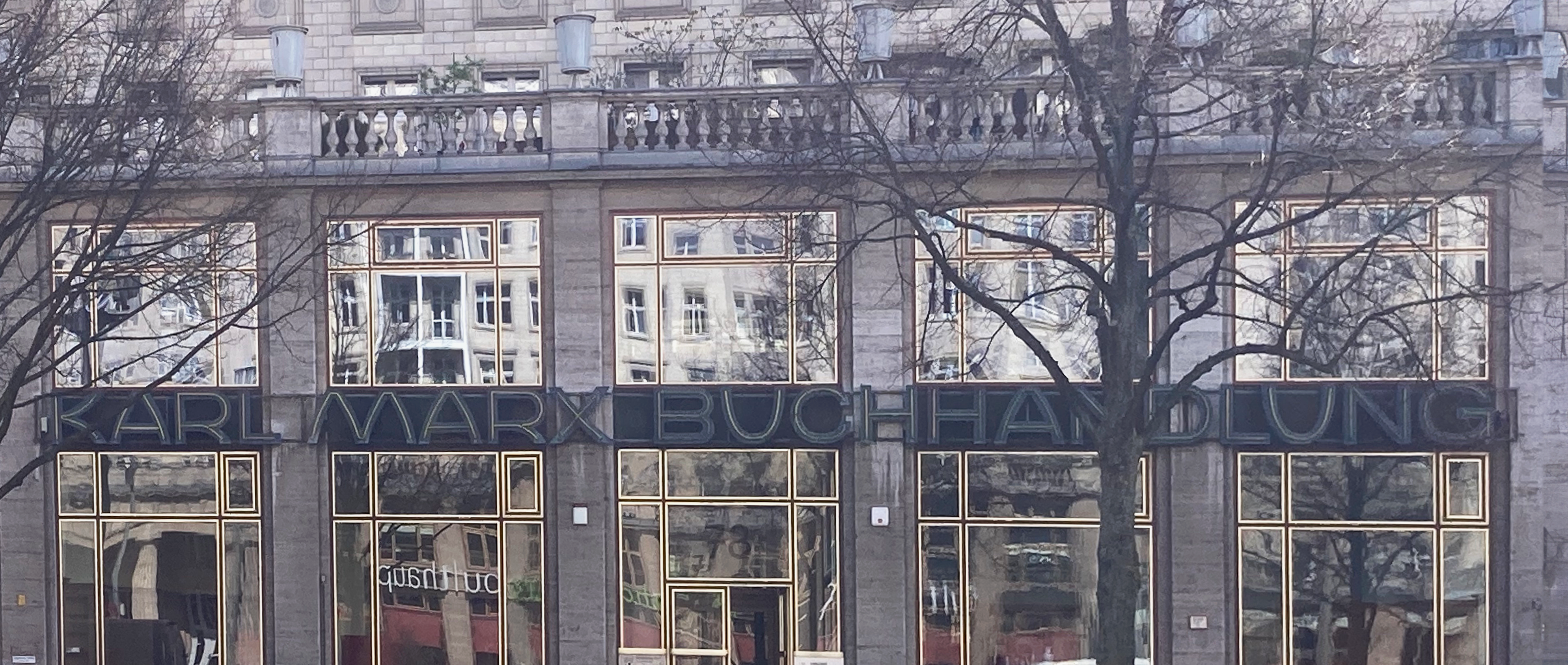
Books are no longer for sale here, even if the sign would suggest so. Both this original neon sign on the storefront of what was once one of East Berlin’s most renowned bookstores and the bookshelves inside are now protected monuments.
© Clarissa Lütz, Fachhochschule Potsdam, 2023
Seen in films such as “Good Bye Lenin” or even “The Lives of Others”, it is now only a backdrop. The last bookseller had to declare insolvency in 2008, and since then there have always changing tenants: inside on Karl-Marx-Allee 78. The large lettering “Karl Marx Buchhandlung” stretches almost across the entire width of the store. It divides the window in front of the shop window horizontally into two sections. Yellow neon tubes stand out against blue letters, designed in squat and wide capitals. The diagonals of the “M’s” and “A’s” push outward in a slight curve.
Briefmarken
Similar to the bookstore’s sign, the “Briefmarken” sign is also a remnant from times gone by that no longer has anything to do with the contents of the store. Today, the former stamp store at Karl-Marx-Allee 99 is home to “Briefmarken Weine”, a cozy wine bar with a small Italian kitchen. The owners liked the old sign so much that they finally integrated it into the name of their restaurant. The simple, static green neon lettering on a green background is in capitals.
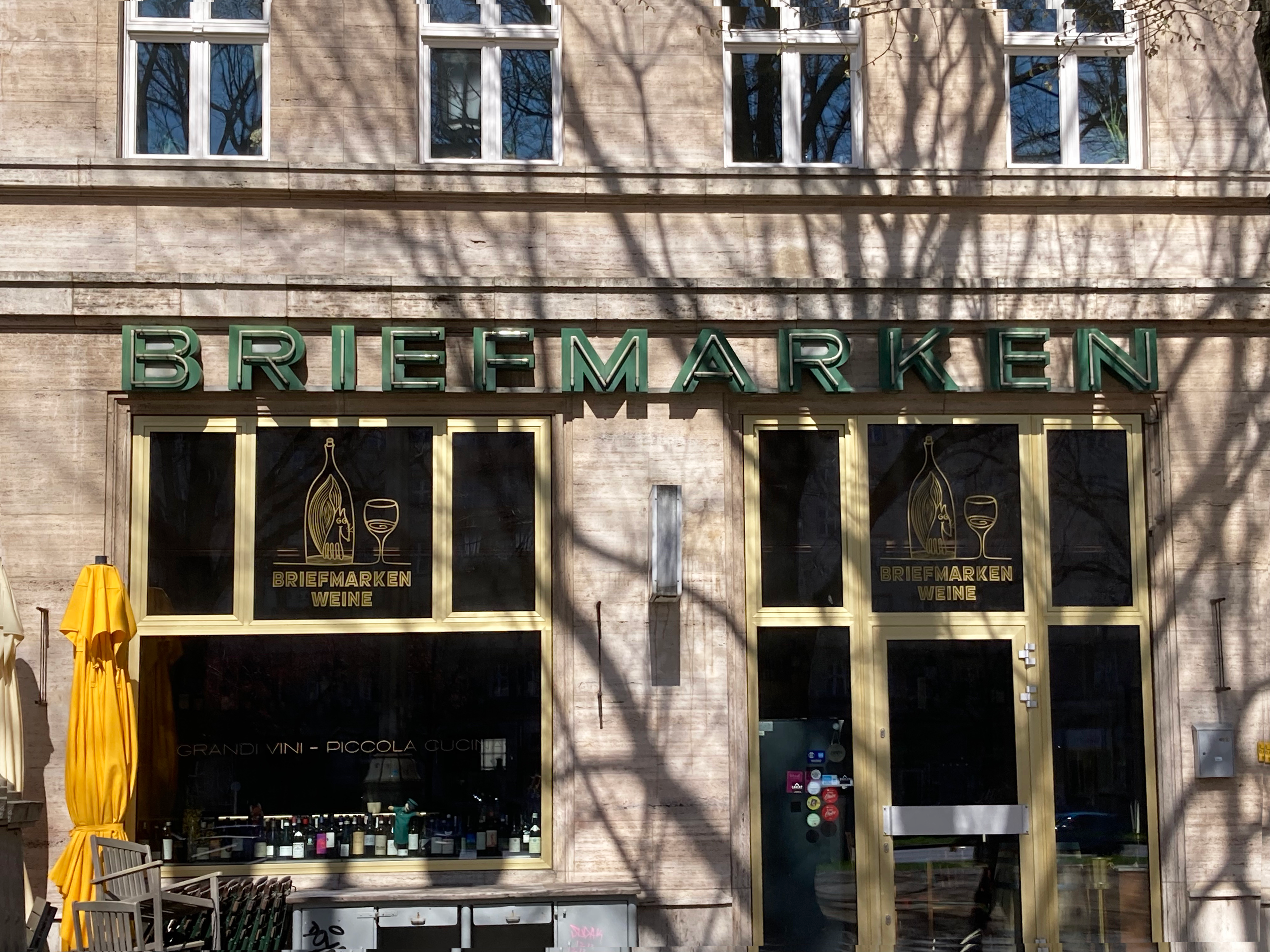
© Clarissa Lütz, Fachhochschule Potsdam, 2023
Kaffee und Tee
Not only the design but also the respective content of the neon signs on Karl-Marx-Allee corresponded to the socialist idea. Even advertising signs were therefore purposefully oriented to counter capitalist manipulative advertising. In this store at Frankfurter Tor 5, there was coffee and tea, this sign informs us factually and soberly, without encouraging us to buy.

© Clarissa Lütz, Fachhochschule Potsdam, 2023
It is nevertheless designed: in yellow and red neon letters that glow orange in the evening and are modeled on a dynamic handwriting tilted to the right. The double “ee” at the end of each coffee and tea is sweeping and differently designed, and the three words are placed in a slight offset and are further emphasized by the broken underline, which is also illuminated with neon. This makes the font look inviting, but not intrusive. ↘ 4 DDR-Archigrafie. Article: www.moderne-regional.de/fachbeitrag-baubezogene-schrift-in-der-ddr/. 