Not Flat and Rigid
but Immersive
and Constantly
Changing
*Text by Tilla Borner*
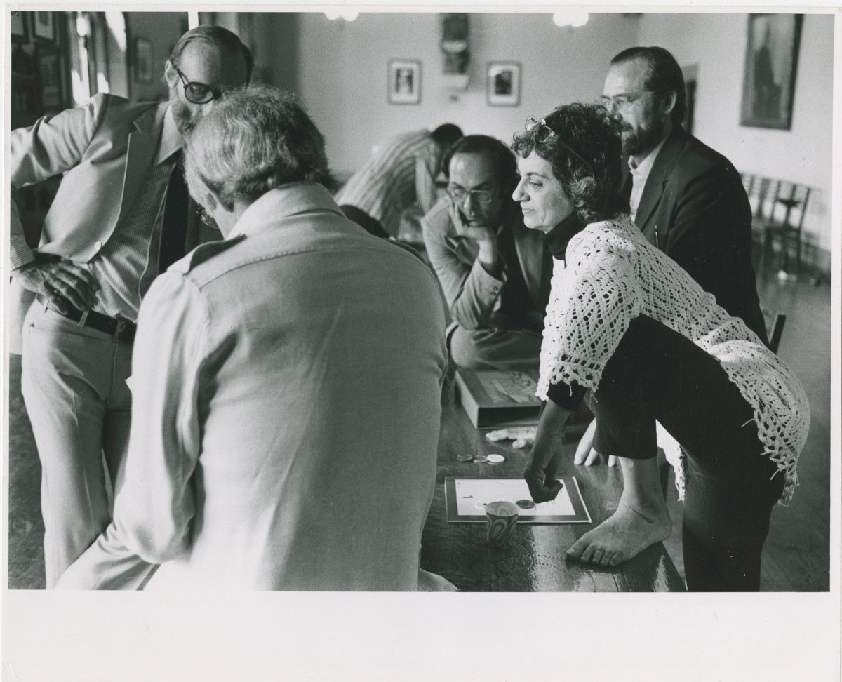
“If today’s ever-expanding information universe began with one big bang, she was squarely at the center of it.” ↘ 1 Muriel Cooper: Designing a Bridge Between the Bauhaus & the Digital Age. Article: 99percentinvisible.org/article/muriel-cooper-designing-bridge-bauhaus-digital-age/, MIT Press is a quote by Pentagram’s Michael Bierut. He is talking about the designer, educator and scientist Muriel Cooper, which the New York Times described in 2007 as “the design heroine you’ve probably never heard of.” ↘ 2 Muriel Cooper: The unsung heroine of on-screen style. Article: www.nytimes.com/2007/09/28/style/28iht-design1.1.7670693.html.
© Muriel R. Cooper Collection, Courtesy of Massachusetts College of Art and Design Archives
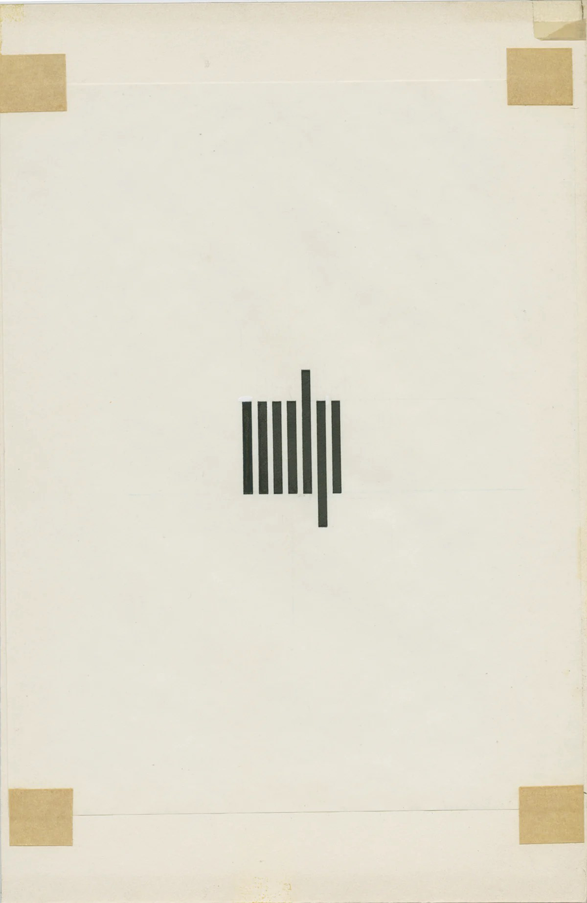
Cooper is best known for her design for the logo of the MIT Press ↘ 3 Established in 1962, the MIT Press is affiliated with the Massachusetts Institute of Technology (MIT) in Cambridge, Massachusetts. It is one of the largest university presses in the world and a leading publisher of books and journals at the intersection of science, technology, art, social science, and design. Website: mitpress.mit.edu (1952).
© Muriel R. Cooper Collection, Courtesy of Massachusetts College of Art and Design Archives
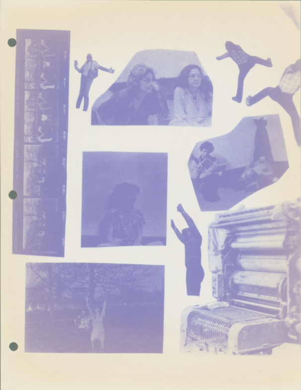
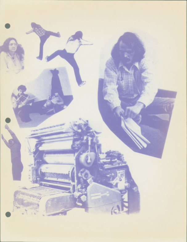
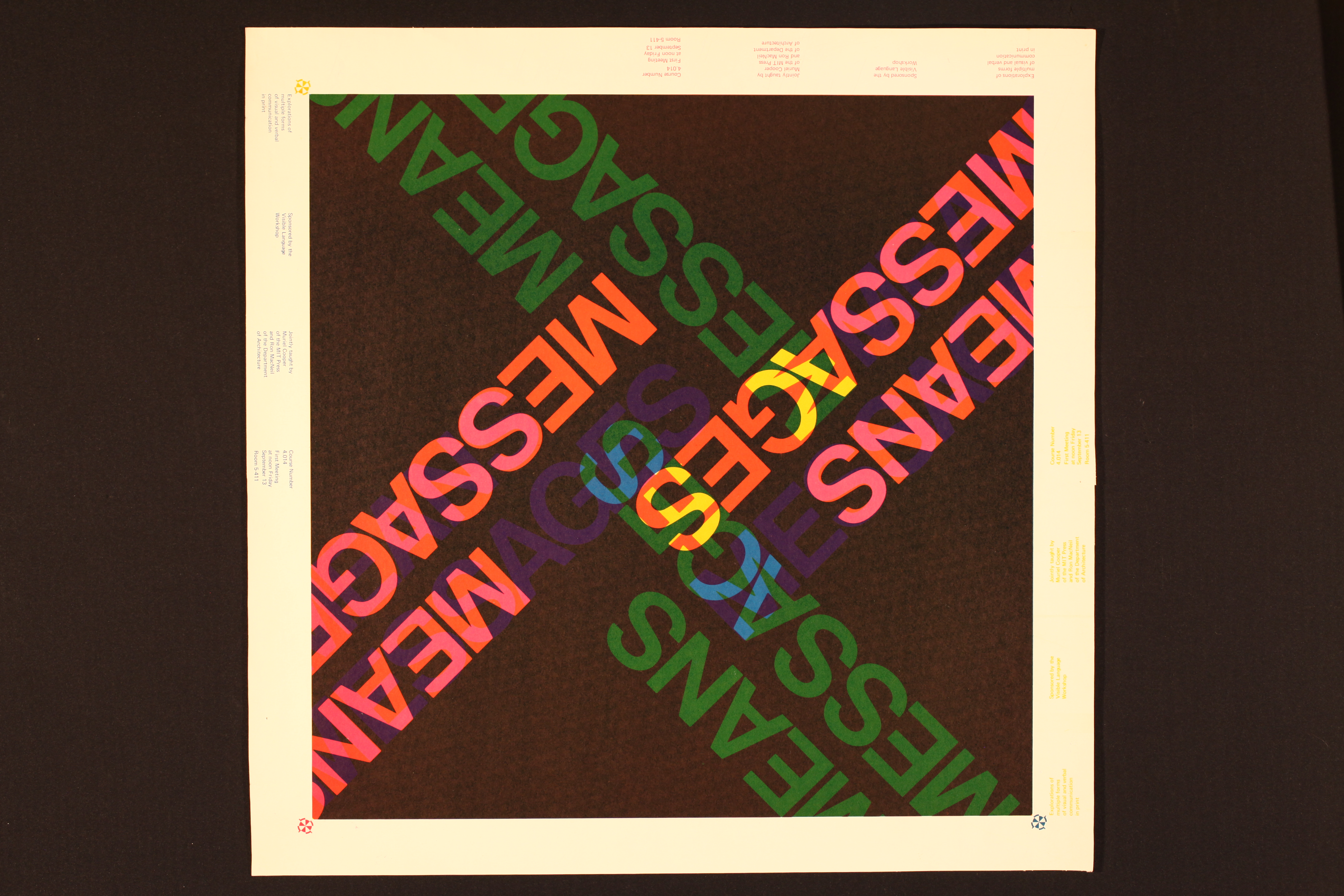
Together with Ron MacNeil Cooper co-founded the Visible Language Workshop at MIT in 1973, which evolved out of her previous course Messages and Means.
© Muriel R. Cooper Collection, Courtesy of Massachusetts College of Art and Design Archives
© Muriel R. Cooper Collection, Courtesy of Massachusetts College of Art and Design Archives
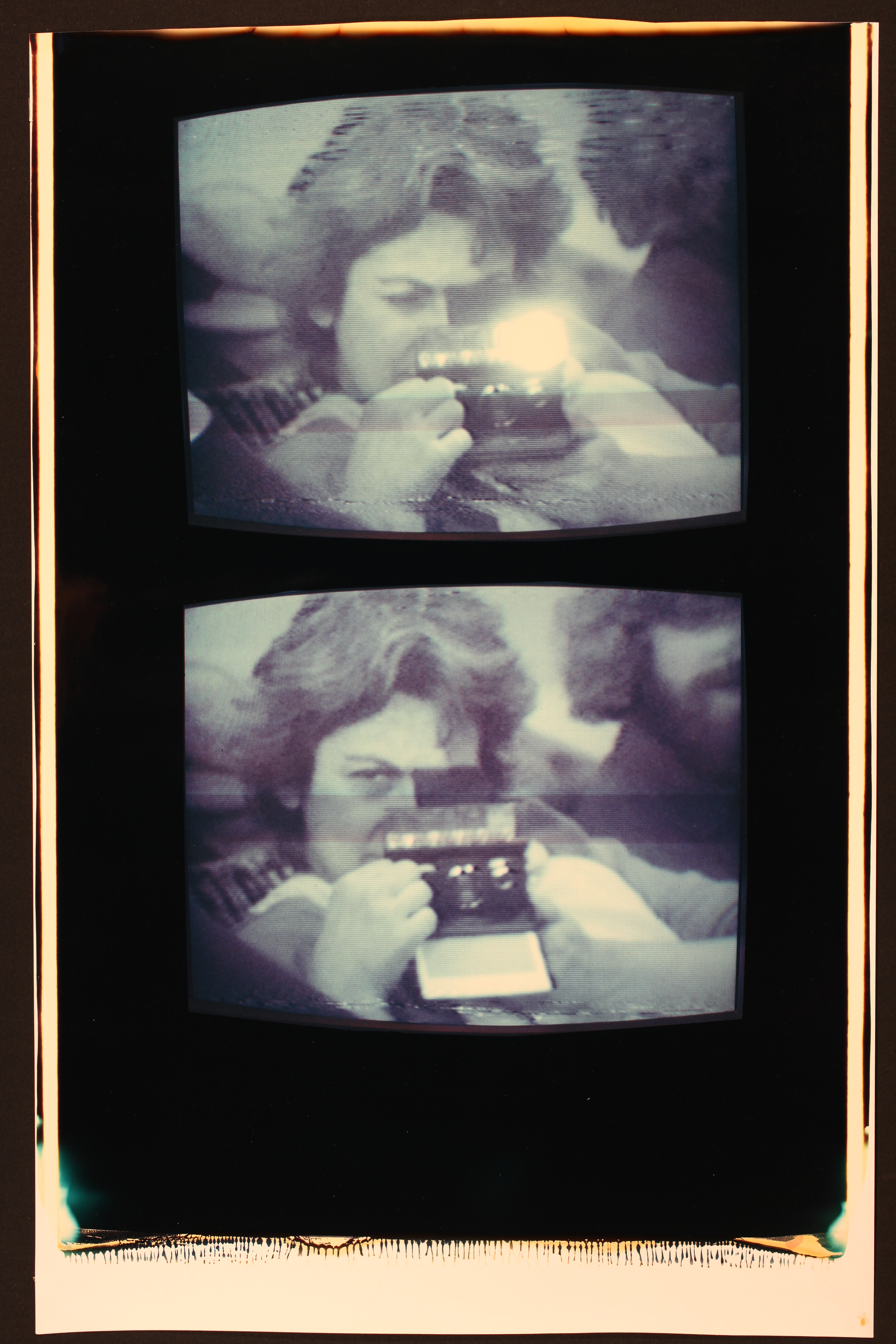
With the Visible Language Workshop Cooper and MacNeil created a space, in which students could explore and experiment with photography, typesetting, platemaking and particularly examining interactive design.
© Muriel R. Cooper Collection, Courtesy of Massachusetts College of Art and Design Archives
© Muriel R. Cooper Collection, Courtesy of Massachusetts College of Art and Design Archives
In the late 1970s, Cooper turned her focus to digital interfaces and computer-based graphic design. “When you start talking about design in relation to computers, you’re not just talking about how information appears on the screen, you’re talking about how it’s designed into the architecture of the machine and of the language.” Muriel Cooper said just shortly before she died in 1994. “You have different capabilities, different constraints, and variables than you have in any other medium, and nobody even knows what they are yet.” ↘ 4 MIT News: Muriel Cooper. Article: news.mit.edu/1994/cooper-0601.
Exploring dynamic design spaces
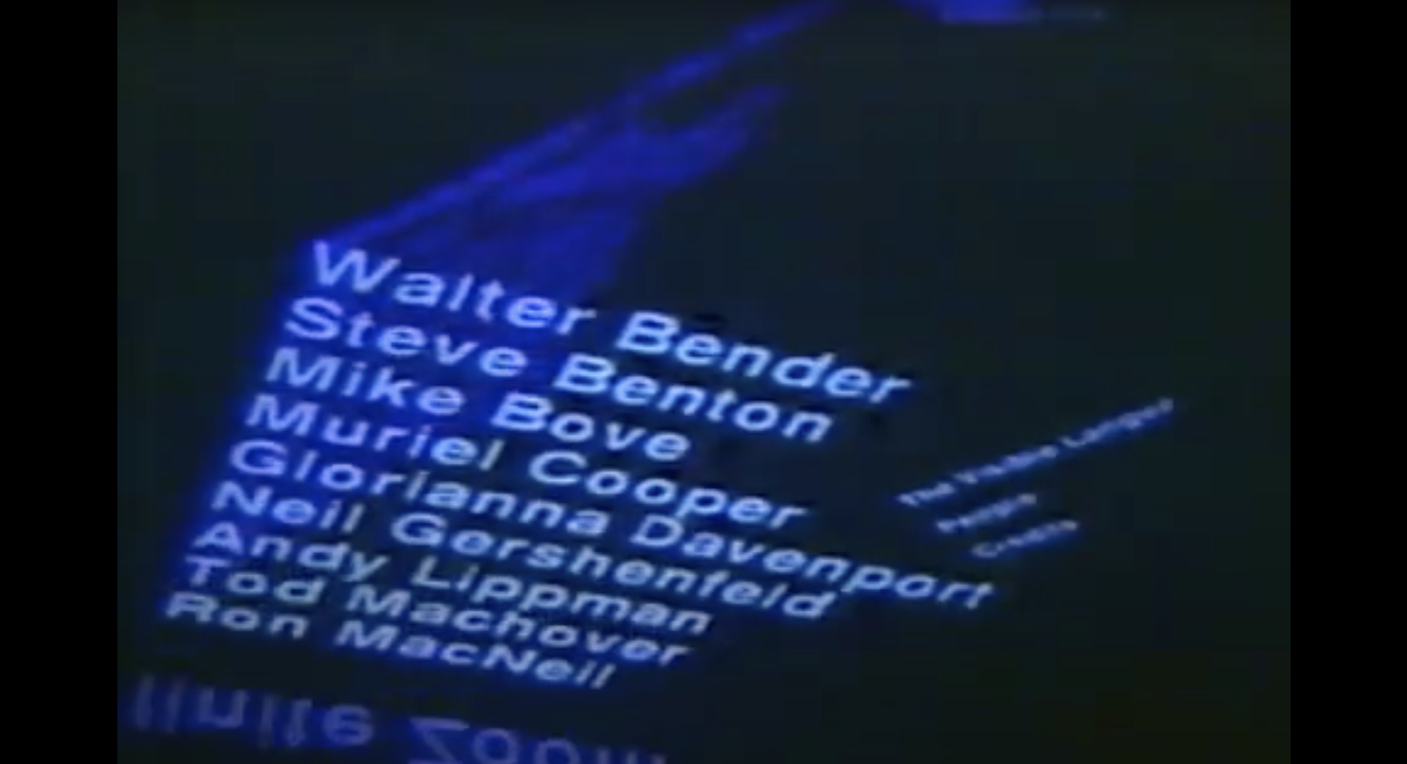
In 1994, shortly before her death, Cooper presented what she called Information Landscapes at the TED 5 Conference in California. The Information Landscapes was a series of projects she worked on with her students Suguru Ishizaki, David Small, and Lisa Strausfeld for about 10 years as part of the Visible Language Workshop at the MIT Media Lab. ↘ 5 Muriel Cooper, Information Landscapes: Article: www.revue-backoffice.com/en/issues/01-making-do-making-with/nolwenn-maudet-muriel-cooper-information-landscapes.
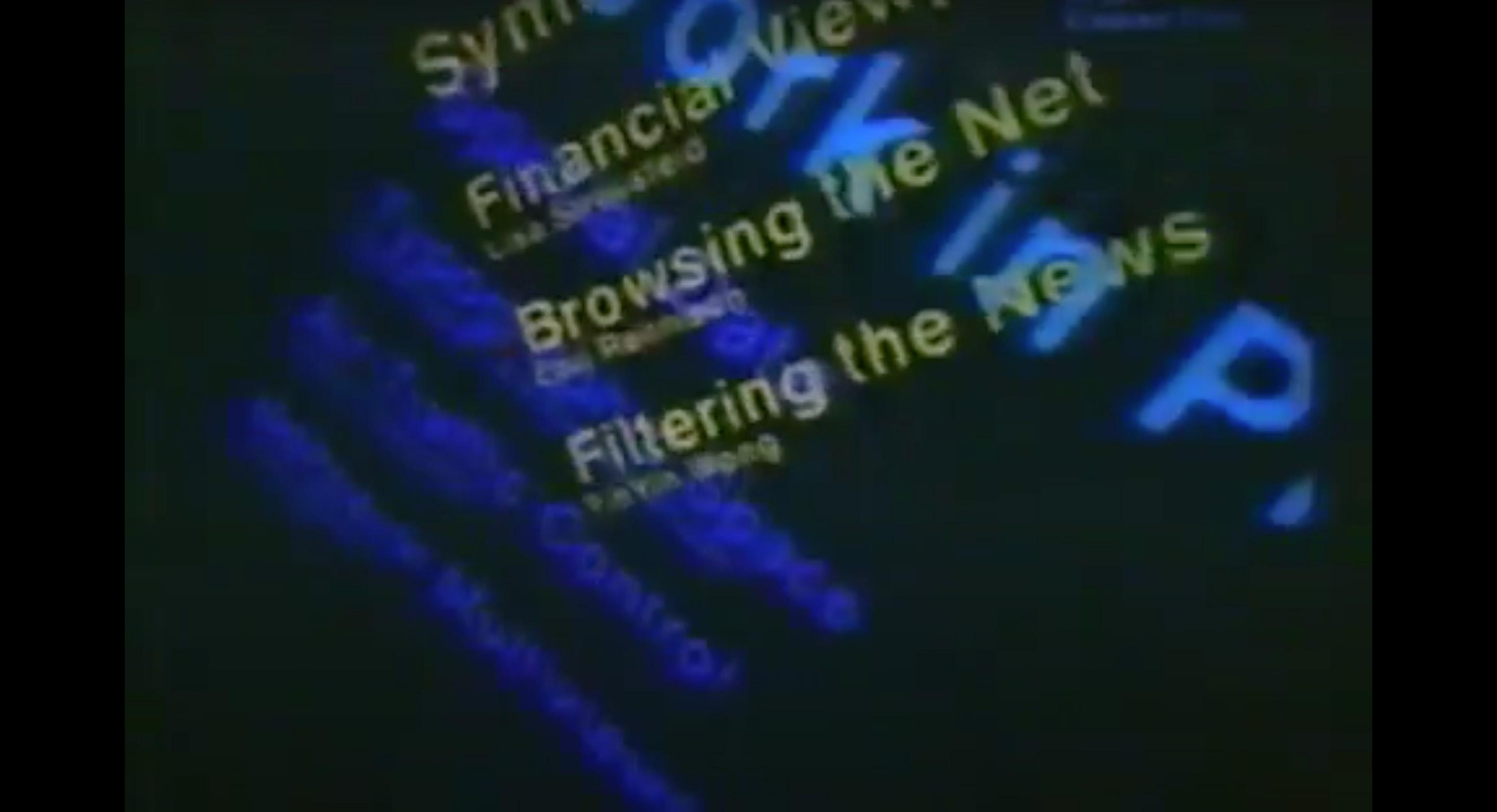
The Information Landscapes depicted a new interface that explored the possibilities of computer and graphic design in the digital realm and explored 3D visions of cyberspace, which was a completely new approach at this time. The projects offered viewers a new experience in which they took an active role inside this three-dimensional multimedia space, which also had no defined time frame.
© MIT Media Lab, 2018
© MIT Media Lab, 2018
The project Typography in Space showed their approach to how graphic design, especially typography, is no longer just thought of as a printed plan, which is always constructed around restrictions. The computer screen is also a delimited window, but Cooper’s work resulted in visual works that were dynamic, immersive, and constantly changing and somehow alike the human’s field of vision. Moreover, the typographic elements were constantly changing, creating a variety of different landscapes for the viewer.
Due to the spatial arrangement of the typographic elements, readers were not told in which order they should grasp the information. Thus, this arrangement allowed readers to connect and compare information and to really experience and discover what they read, which would not have happened in a linear presentation.
Nowadays, this approach can also be seen in the use of AR or VR technology, where typography can be placed in the “real world”, filling the space three-dimensionally. An example of a project using AR can be found here. ↘ 6 Henriette Greßler: AR-Audiowalk Annemarie-Wolff-Platz: Project: fhp.incom.org/project/20480.
In this case, the viewer can move around and decide for themselves what information one is looking at and when. One gets in touch with the typography, and moves around it as if it were an object or even a subject. So here a change takes place: typography as a two-dimensional design tool, whose primary purpose is to transmit information, transforms into something that stands for itself and can be seen and interpreted from many different perspectives.