Rising Rent
and
Shifting Fonts
About the Impact
of gentrification
on the typographic cityscape
Text by Johanna Bölke
The Schillerkiez in Neukölln is currently one of the neighborhoods in Berlin most marked by urban change and neighborhoods transformation due to gentrification. Gentrification is defined as “the process of improving an area of a town or city so that it attracts people of a higher social class than before.” ↘ 1 gentrification. Definition: www.oxfordlearnersdictionaries.com/definition/english/gentrification#:~:text=gentrification-,noun,higher%20social%20class%20than%20before. Can something like this urban change and neighborhood transformation be observed in the lettering, and the typography itself? How does this change affect the typographical appearance of the Kiez?
Schillerkiez
Initially planned in a grid pattern as a bourgeois neighborhood at the end of the 19th century, the Kiez runs from Leinestraße in the south up to Columbiadamm, borders Tempelhofer Feld to the west and Herrmannstraße to the east. About a hundred years later, after the closing of the Tempelhof airport, the Kiez and its surrounding areas in Neukölln belonged to the cheap living of working-class or migrant households in Berlin. Since the reopening of the former airport as the today well-known Tempelhofer Feld in 2008 and its access from Herrfurthstraße in 2010, the Kiez with its formerly affordable rents has become the subject of interest for many. With increasing interest and moving, it is not only the social constitution of the neighborhoods that has changed rapidly.
Urban Type Walk
This article takes you on a walk past the former Ingenieurschule für Bauwesen via the traditional Fraktura typeface on the corner pub to the round, poppy shapes of the vintage shop and the minimalist logo of the art gallery. The Schillerkiez therefore can be seen as an example of the contrast and coexistence of more historically as well as more modern typefaces. The different stations of the Urban Type Walk not only hint at typographic trends but also refer to the background and history of the individual locations and the orientation of the places.
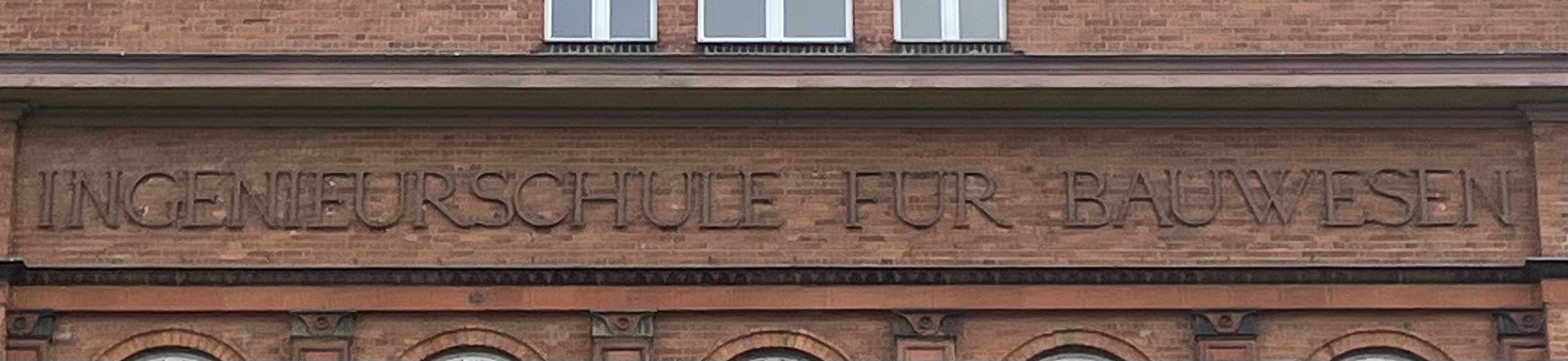
Former Ingenierschule für Bauwesen
The former School for Engineering at Leinestraße 37, founded shortly after the Schillerkiez was built in 1913, is the oldest typography station on this walk. The big brick stone building is placed right in the middle of Leinestraße and marks the southern end of the Kiez.
© Johanna Bölke, Fachhochschule Potsdam, 2023
Both the former school and the church Herrfurthplatz with their red-brown to dark-red colours characterize the colours of the neighbourhood. The building which was used as a secondary school during the time and, in times of COVID-19, as a test centre for the City of Berlin – is currently empty. The lettering indicating the origins of the building has survived to this day in the upper section of the old school. It is an antiqua typeface consisting exclusively of capitals. The kerning of the various characters is narrow so that the individual characters almost bump into each other. On the other hand, there is plenty of space between the words. The long name of the school should be visible and readable from the streets and refer to the forms of the classical gable triangle with a frieze. The small serifs and the low-stroke contrast are also striking. The “W”, which has no crest with crossing up and down strokes, is also memorable.
Bechereck
Bechereck at Okerstraße 35, the corner pub between Okerstraße and Schillerpromenade, has been in the same place since 1984.

© Johanna Bölke, Fachhochschule Potsdam, 2023
A lot has happened since then: The change of ownership, the closure of Tempelhof Airport and the opening of the field in 2008, adjusted opening hours and a new clientele. It’s hard to imagine the corner without this pub with its cosy furniture, which fits perfectly into the variety of newer bars, cafés and late-night shops. The type design and the figurative logo have remained: the old German Fraktur typeface traditionally and frequently used in old Berlin pubs and restaurants, with two colourful figures framing the entrance on the right and left. The initial “B” is decoratively designed and stands out from the following minuscules. The serifs are also decoratively laid out with a bend in the middle. All the characters are kept in brown and have a yellow shadow that contrasts with the white background of the shield. The example of Bechereck shows particularly well how the use of lettering is also changing in the pub context and adapting to newer tastes. In the meantime, the Fraktur is probably used less frequently for modern pubs.
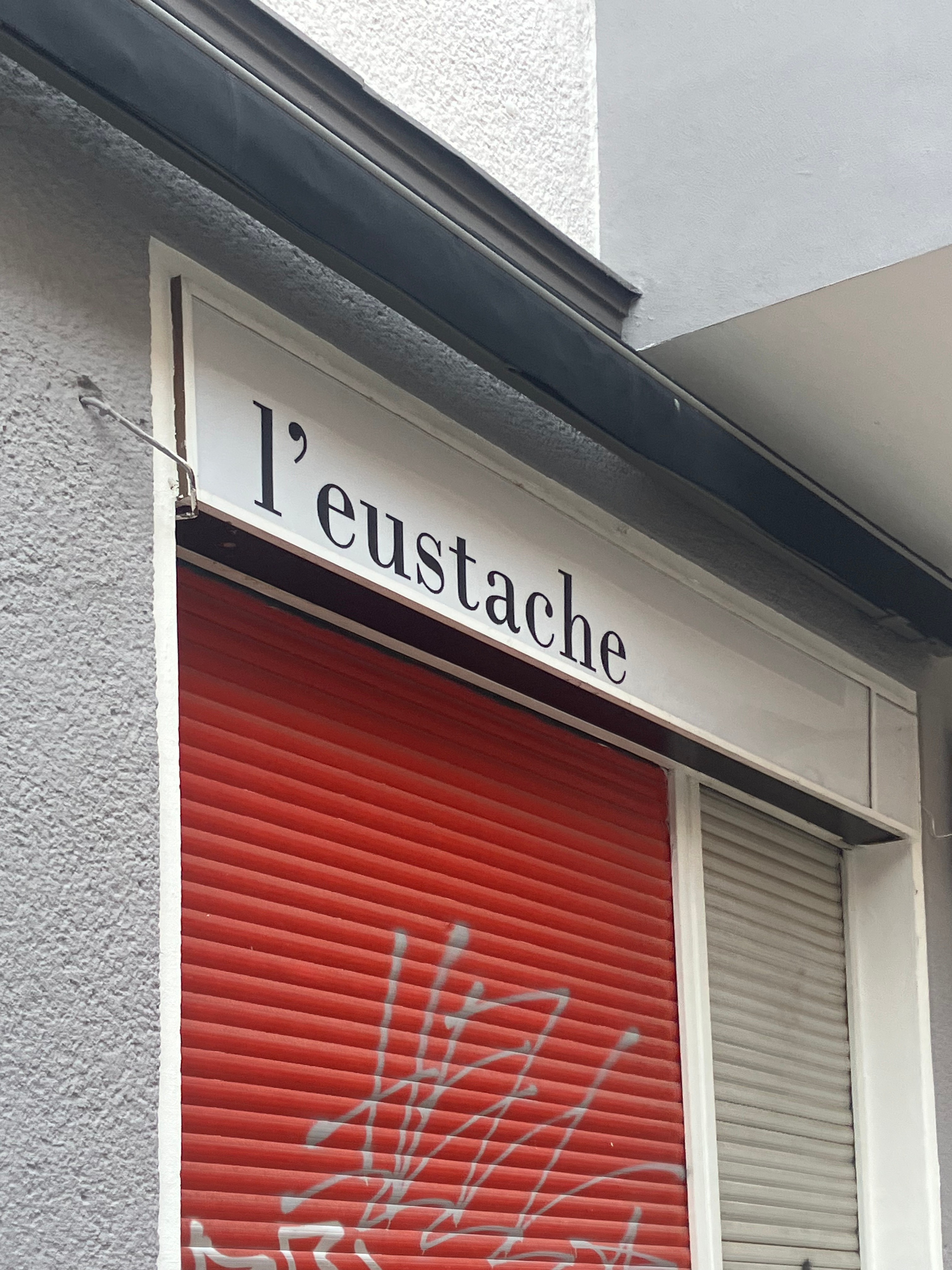
L’Eustache
The French restaurant L’Eustache at Weisestraße has been part of the Schillerkiez since 2015. It serves selected dishes based on seasonal and regional offers. The restaurant fits into a series of newer, medium-priced places and is intended to appeal to people from the neighborhood as well as visitors from further away. At closing hours, it is barely visible since it is located in a regular apartment building typical for the Kiez.
© Johanna Bölke, Fachhochschule Potsdam, 2023
Typographically, the logo reminds of an antiqua font with straight axes, which focuses on understatement and its static effect. Matching the understated menu and their seasonal products, the design is clear with a certain seriousness. The fine line serifs are striking, but this is softened by the drops in the letters’ endings. Together with the symmetrically designed logo consisting of a knife, fish, plant and drops, the overall impression is relaxed despite the static typeface.
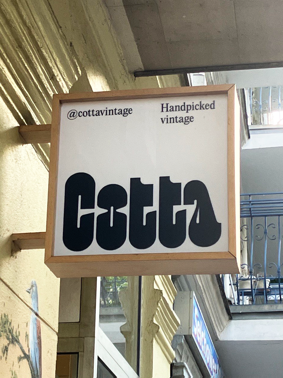
Cotta Vintage
The sign and the name “Cotta” are brand new. The small second-hand shop with selected clothes in Selchower Straße 33 has been around for a few years but under a different name.
© Johanna Bölke, Fachhochschule Potsdam, 2023
A lot is changing here, too. The shop is located in an apartment building and belongs to a larger number of small second-hand shops in the area. It is not only visited by tourists looking for Berlin vintage fashion but also known amongst the residents. Typographically, the sign with its wide, flat letters is striking and the font design evokes playful retro associations. At the same time, the typeface is quite playful and builds a contrast between the clear and geometric shapes of the sign itself. The characters, black on a white background, appear big and as if blown up, while the punches in the “o” and “a” are kept very narrow without a high stroke contrast. Although the typeface design plays with the vintage idea, the logo appears modern.
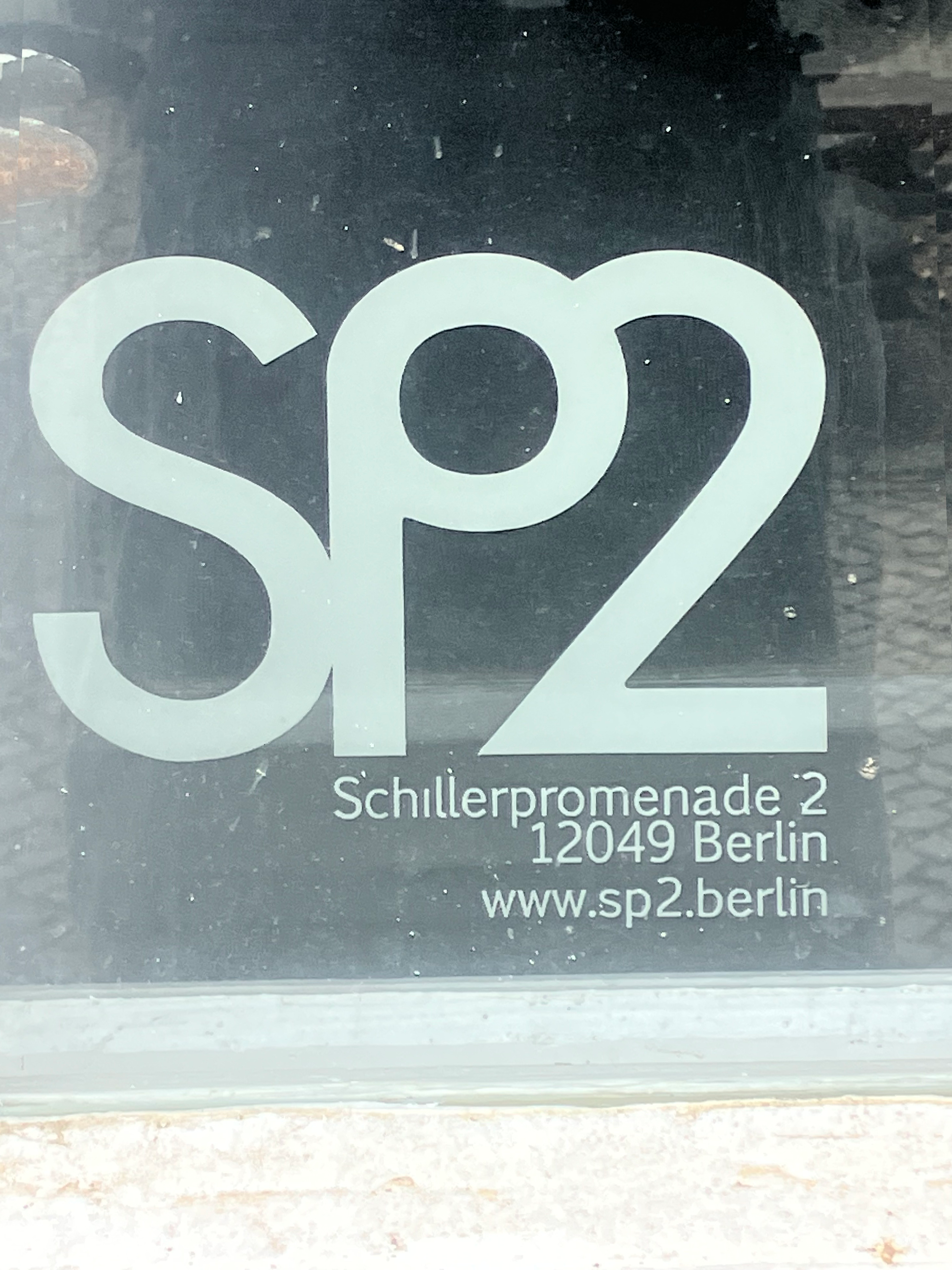
SP2
The SP2 Contemporary Gallery has been situated on the ground floor of Schillerpromenade 2 since 2018. The gallery’s narrow shop windows offer a glimpse into a small exhibition space, showcasing photography, painting, sculpture, and installations.
© Johanna Bölke, Fachhochschule Potsdam, 2023
The exhibitions change every few months and feature international artists. The gallery is curated by the pub owners next door, which is also a popular spot for locals. The gallery’s logo is a sans-serif design that features two capital letters “S” and “P” and the number “2”, all connected by ligatures. The kerning is nearly suspended, with the individual characters virtually sticking to each other. The logo is dynamic and transitional, combining pointed design elements. The logo combines pointed, dynamically transitional, and geometric elements and is easy to read due to the rounded vertices. Despite the simple idea, the logo appears interesting and playful.
Christiane Gluchs Änderungsschneiderei
The tailor located at Herrfurthplatz 4 is inconspicuous and mainly visited by residents. It has survived over the years and is now located between a Pilates studio and an ice cream shop. You can get clothes fitted here at a cheap price or attend sewing workshops. The logo, with blue-green lettering on a white background, is divided into two parts by a mixture of fonts and is now partly faded.
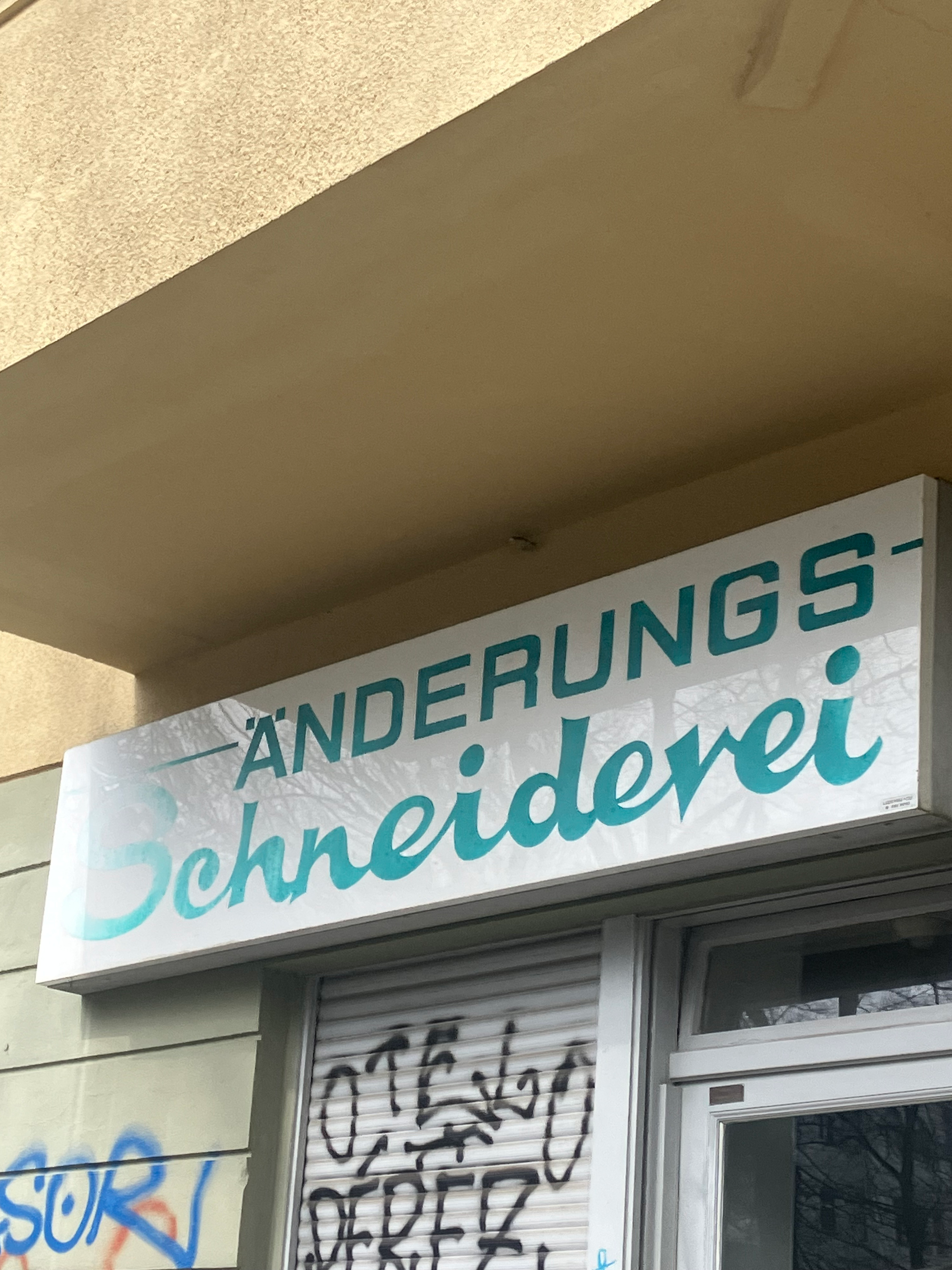
© Johanna Bölke, Fachhochschule Potsdam, 2023
The sans-serif majuscule font in the upper part of the sign is static. In contrast, the lower part appears loose, almost like a cursive handwritten script with irregular punctuation, handcrafted to fit the theme of tailoring. The large dots are circular, and the individual characters are fluidly connected. Although it might not seem remarkable, it has a lovely design and refers to another period of the Kiez.
