Susan Kare
Didn’t Care
(About Low Resolutions)
How the Chicago font
and Macintosh icons were created
Text by Merrit Schomakers
We all know all the cute little smiling Macintosh icon. Or the Chicago font we all had on our first iPods. But how many of us know who we have to thank for those iconic Macintosh assets and how difficult creating something as simple as a small icon was back in 1984? Well, you all will after reading this article.
Becoming a Macintosh artist
The woman responsible for all that is Susan Kare, an American graphic designer and one of the first designers at Apple. After finishing her degree in arts and Ph.D. in fine art in 1978, Susan Kare started working at the Fine Arts Museums of of San Francisco as a curatorial fellow until one day she got a call from an old friend from high school. ↘ 1 Susan Kare. About: kare.com/about/. That friend was working as a developer for the first Apple Macintosh at that time and was looking for someone who could create graphics and a fonts for the operating system. He knew that Susan Kare was good at drawing small-scale mosaic-like images, but she had never designed typefaces. By reading all the typography books she could find in her library, she aced the interview and became a “Macintosh Artist”. ↘ 2 Susan Kare, Iconic Designer. Article: invention.si.edu/susan-kare-iconic-designer.
Creating new standards for screen typography
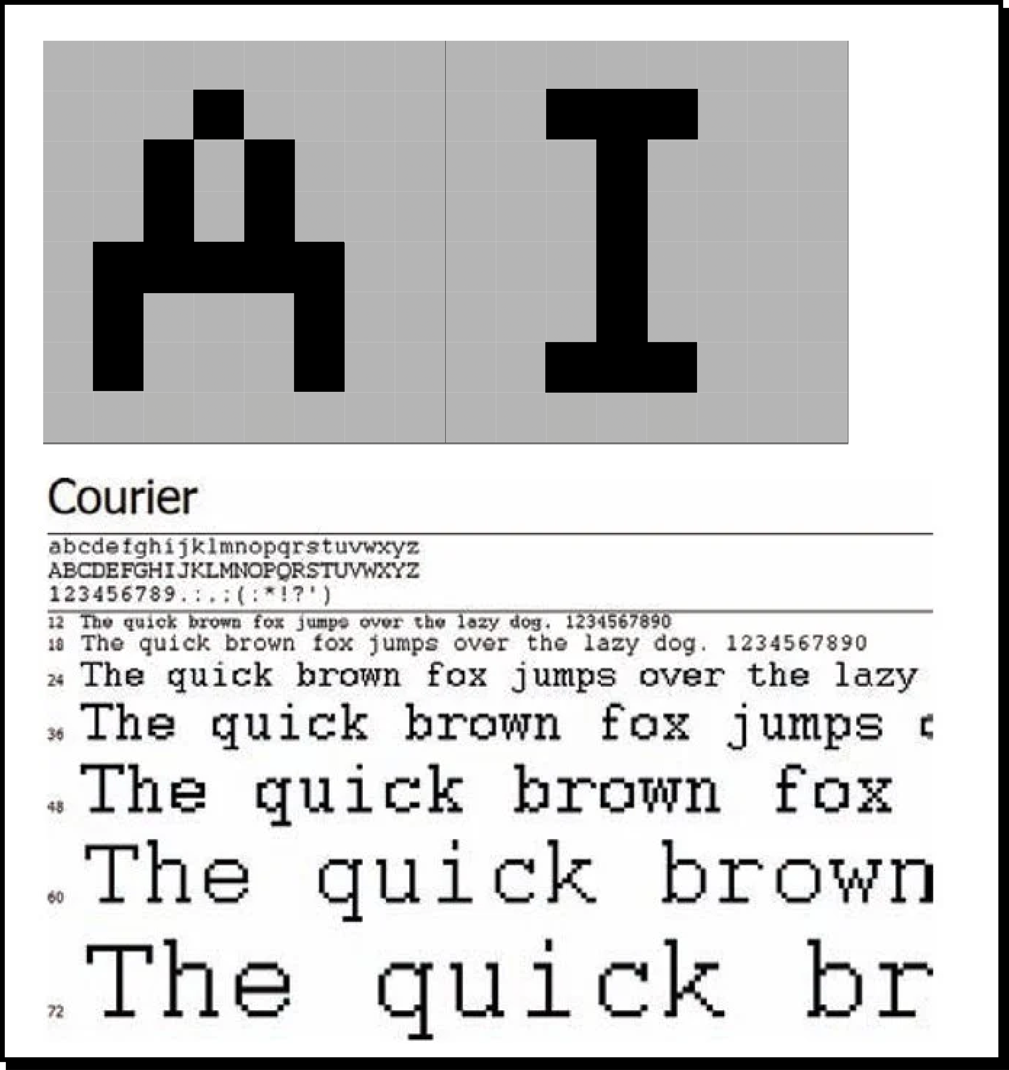
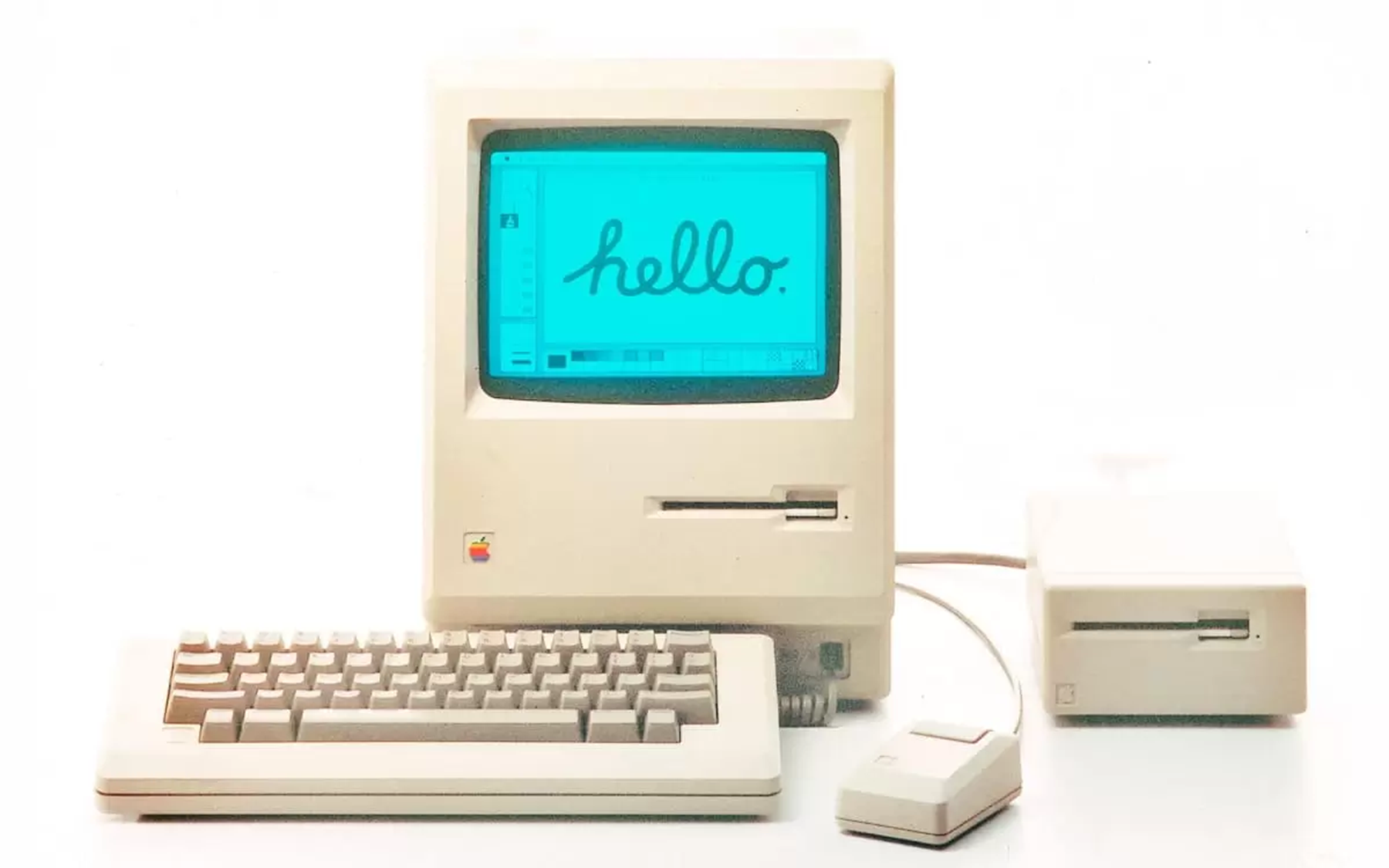
Unlike today, there were no best practices for display fonts in the early 80s. The few existing ones (like the Courier on Linux
© Merrit Schomakers, Fachhochschule Potsdam, 2022
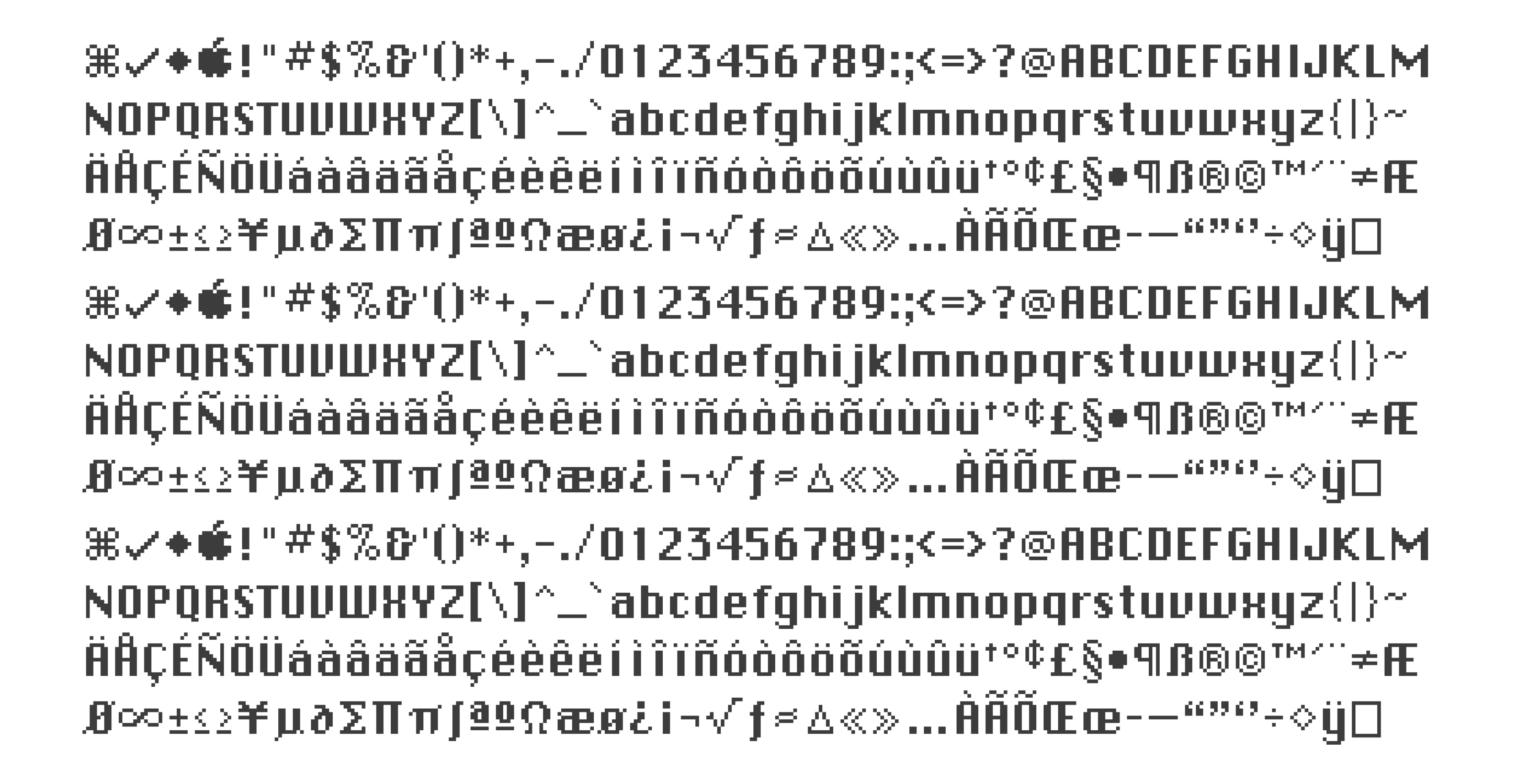
and Microsofts Lucida Console) were monospaced and very jagged, due to the fixed pixels. And so Susan Kare started working on a new display font for the Macintosh, that would be crisper and more easily readable than any of the previous ones – the first proportional display typeface. ↘ 3 Apple fonts. A typographic timeline. Timeline: www.typeroom.eu/apple-fonts-a-timeline. To put everything into perspective: Nowadays, the display of a modern 14-inch Macbook Pro has around 3024×1964 pixels and supports around 1 Billion colors. The device Susan Kare designed for had a resolution and 512×342 pixels and only worked with black and white bitmap. The system font she was hired to design, was to be used for the menus of the interface and therefore had to be highly legible on a low-resolution and grayscale screen proved. With all that in mind, the Chicago ↘ 4 Chicago typeface. The Friendliness of Chicago. Article: slate.com/culture/2014/09/chicago-typeface-apple-computer-font-made-for-macintosh-and-used-on-ipod-felt-friendly.html. was created – a font that was proportionally spaced and looked more rounded, by only putting elements horizontally, vertically or diagonally and could also display “greyed out” text with deactivated pixels.
© Apple
© Apple
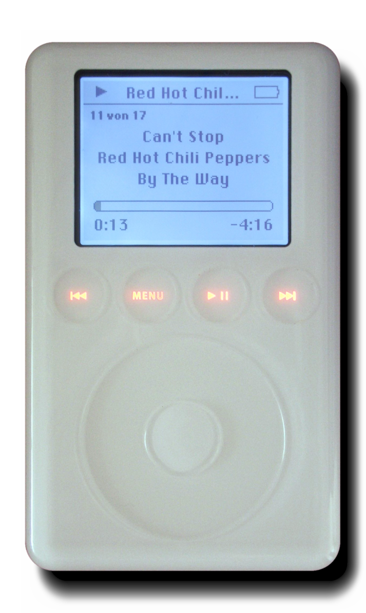
As a pixel font, the Chicago only came in one size, 12pt, until it was vectorized by Bigelow & Holmes in 1991. Chicago was used until 1997 with Mac OS 8.0 on the Macintosh, the Portable and the Powerbook.
© Apple
With the 2001 release of the iPod the font was revived and used again until the fourth generation due to its great readability at low resolutions.
© Ilmari Karonen, 2006
Designing for better user experiences
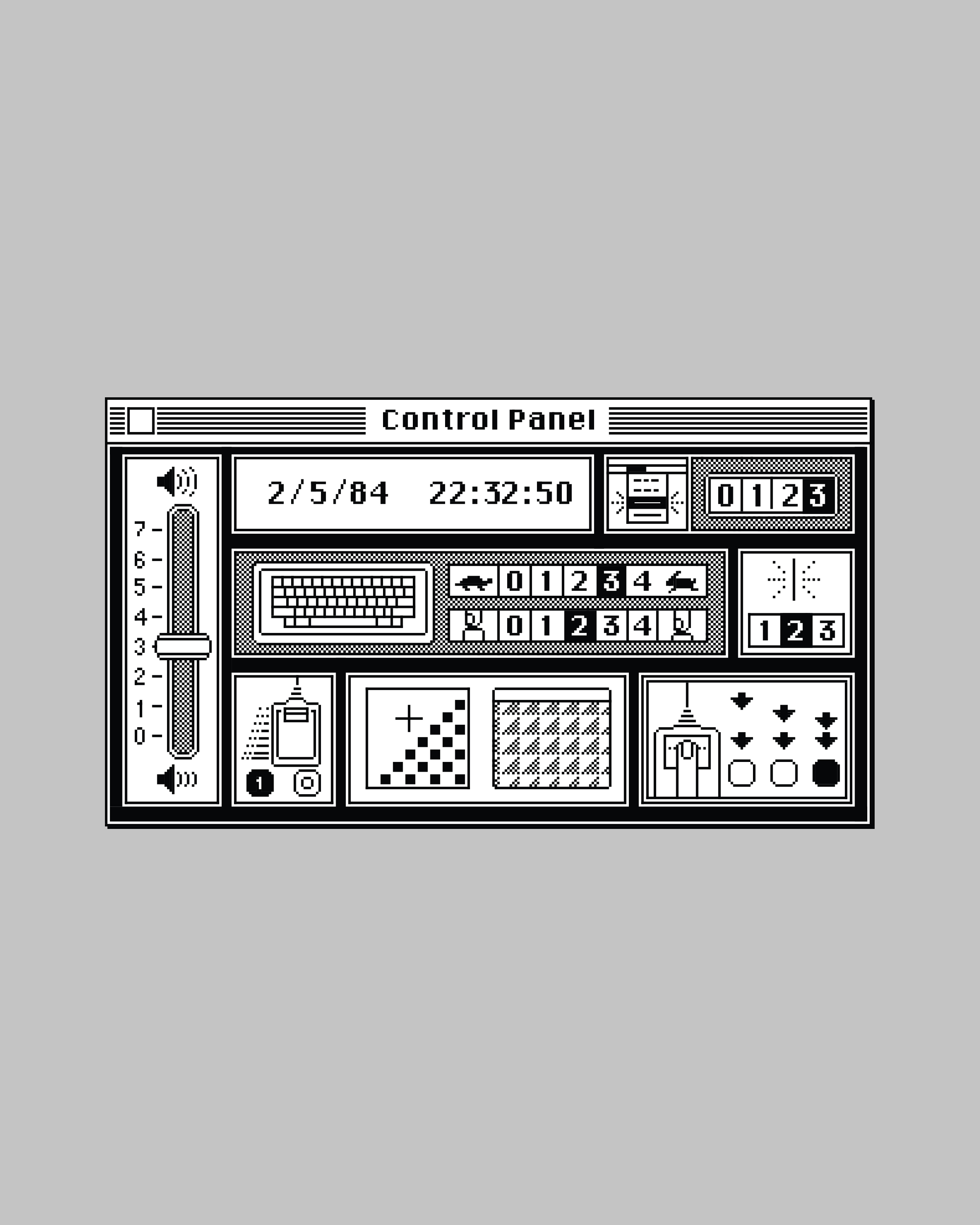
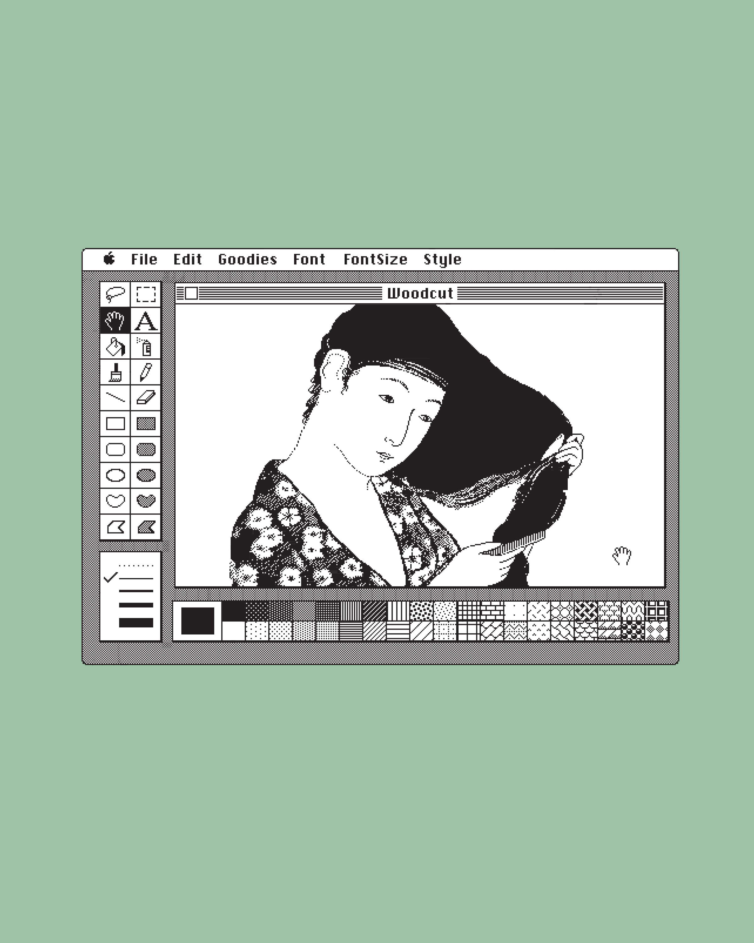
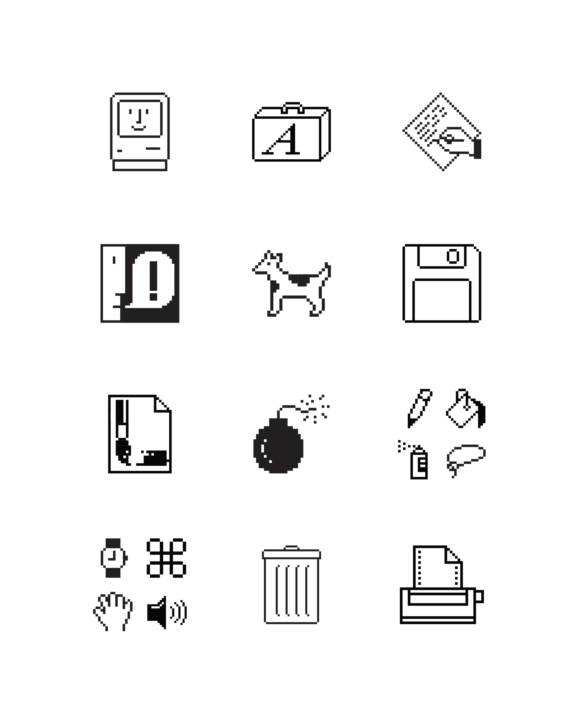
The next big challenge was creating the icons for the Macintosh’s interface. Back then, interfaces were mostly made of text and code which was not accessible to everyone. The mission of the Macintosh was to have a user-friendly device that could be used intuitively by anyone. It was a real challenge to come up with symbols for actions and items, that had never been visualized before with the restrictions of a small resolution screen. To design the Icons, Susan Kare used a gridded notebook and started scribbling icons in 32×32 “pixels”. She wanted the icons to be friendly and even a little funny, to ease stressed users. The icons she came up with in the end were a building block for many current icons, like the cursor, folders, trashcan, volume or even the “command” symbol. ↘ 5 The Woman Who Gave the Macintosh a Smile. Article: www.newyorker.com/culture/cultural-comment/the-woman-who-gave-the-macintosh-a-smile.
© Apple
Although many people don’t know Susan Kare, she was the one who gave the first Macintosh its face and its first user interface graphics.
