Walls
that Speak
Exploring typographic murals
of Berlin’s Kreuzberg
and Mitte districts
Text by Yevheniia Shyrchenko
Berlin is a sprawling metropolis that beautifully blends its rich history with modern elements. The districts of Mitte and Kreuzberg are especially noteworthy for their vibrant atmosphere, where the streets are adorned with striking typographic installations. These installations are a fusion of various typographic styles that reflect the diversity of the area. This article focuses on the beauty and distinctiveness of these art pieces and how they capture the essence of protests and historical transformations through typography.
“How long is now?” on Oranienburger Straße
The “Kunsthaus Tacheles” was an unique artistic and cultural venue in Berlin that was known for its vibrant and diverse artistic community. It stood as a symbol of artistic freedom and expression. On the East side of Kunsthaus Tacheles, there was a gigantic typographic mural called “How Long Is Now” that attracted visitors for many years.
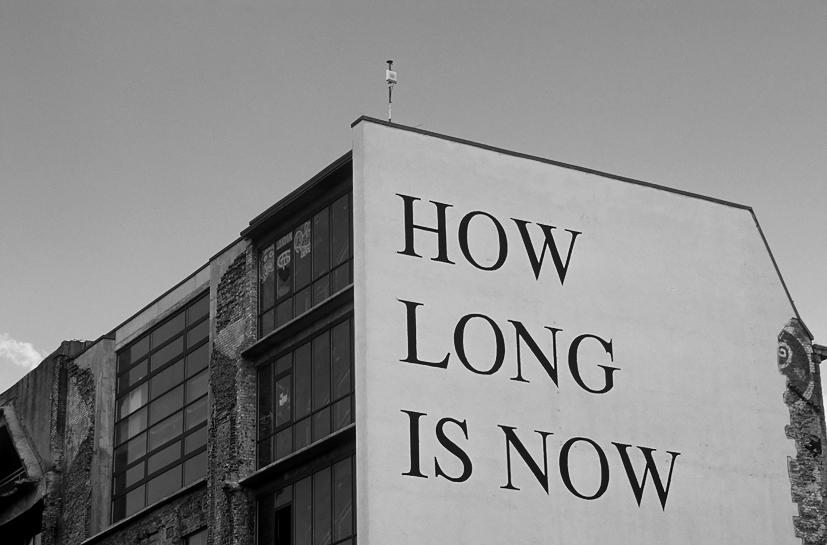
@ The Activists, Archive for FILOART, 2019
It was located on one of Berlin’s liveliest streets and posed a profound existential question that compelled contemplation from those passing by. Perhaps, the artist aimed to immerse visitors in the immediacy of the present moment. Typography played a significant role in enhancing the overall composition of the mural. The artist has skillfully incorporated typographic elements to convey a powerful message. Using a serif, all-caps typeface adds a layer of intensity, making the message even more compelling. The mural was a symbol of the city and embodied the incredible and distinctive atmosphere of the iconic Kunsthaus Tacheles building. After the fall of the Berlin Wall, artists transformed the Kunsthaus Tacheles into a vibrant, eclectic space for creative expression and alternative culture. Unfortunately, in 2020, the mural met an unfortunate fate, as it was destroyed and bricked out due to construction work. The area is slated for redevelopment, with plans to repurpose it for offices, stores, and apartments.
Haus Schwarzenberg
Haus Schwarzenberg in Berlin embraces typography as an art form, showcasing its power to communicate and inspire. With walls adorned in intricate letterforms and expressive fonts, it celebrates the beauty and diversity of typographic design. Drawing inspiration from the city’s rich history and diverse culture, artists Dede Bandaid and Nitzan Mintz collaborated on a typography mural at Haus Schwarzenberg in Berlin. Their skillful blend of calligraphy, graffiti, and contemporary design created a captivating visual composition. The mural became a symbol of the city’s creative spirit, inviting viewers to engage with the power and beauty of written expression.
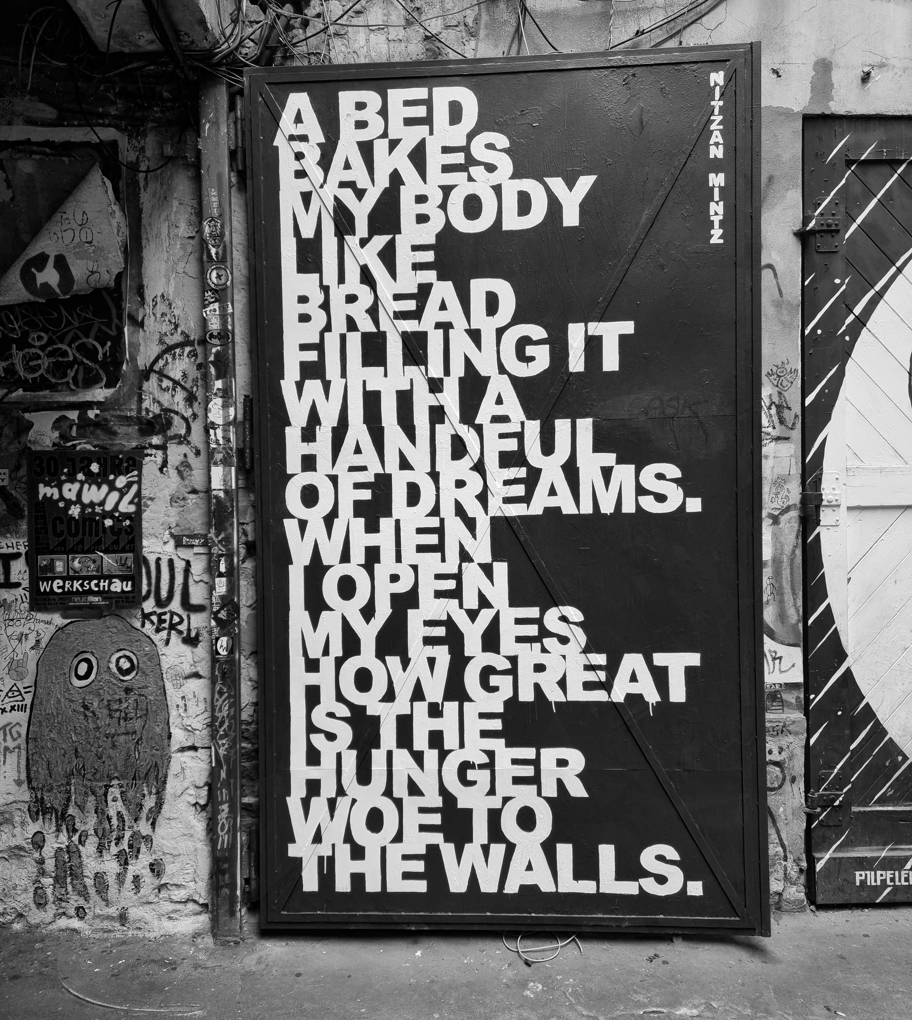
© Yevheniia Shyrchenko, Fachhochschule Potsdam, 2023
“What remains?” on Oranienplatz
The installation located at Kreuzberg’s Oranienplatz
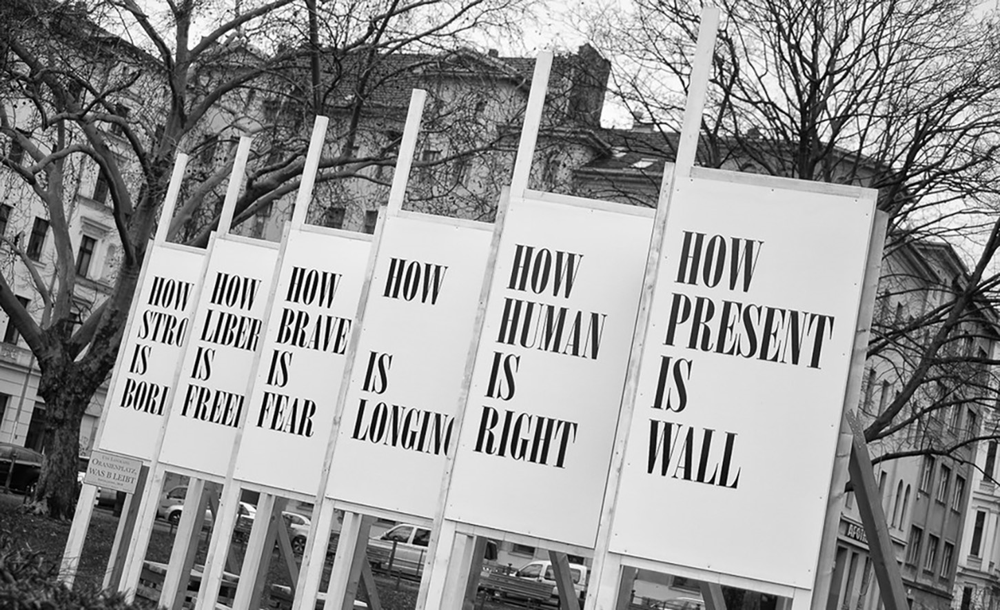
@ Andrea Linss, 2020
is a reference to the former notice boards that were placed on the so-called sector border between East and West Berlin before the Wall was built. These were intended to encourage the residents of East Berlin to attend cultural events in West Berlin. Three decades after the fall of the Wall, artist Ute Langkafel will use her intervention to raise questions about the current state of society. For this typographic installation, the artist chose a modern serif font, which has a strong contrast between thick and thin strokes. The design showcases dramatic large letterforms that capture the viewer’s attention and encourage them to reflect on the questions being posed.
“Dieses Haus stand früher in einem anderen Land” on Brunnenstraße
In November 2009, to mark the 20th anniversary of the fall of the Berlin Wall, artist Jean-Remy von Matt inscribed the facade of a building on Brunnenstraße in Berlin-Mitte with the words: “The human will can move everything. This house used to stand in another country.”
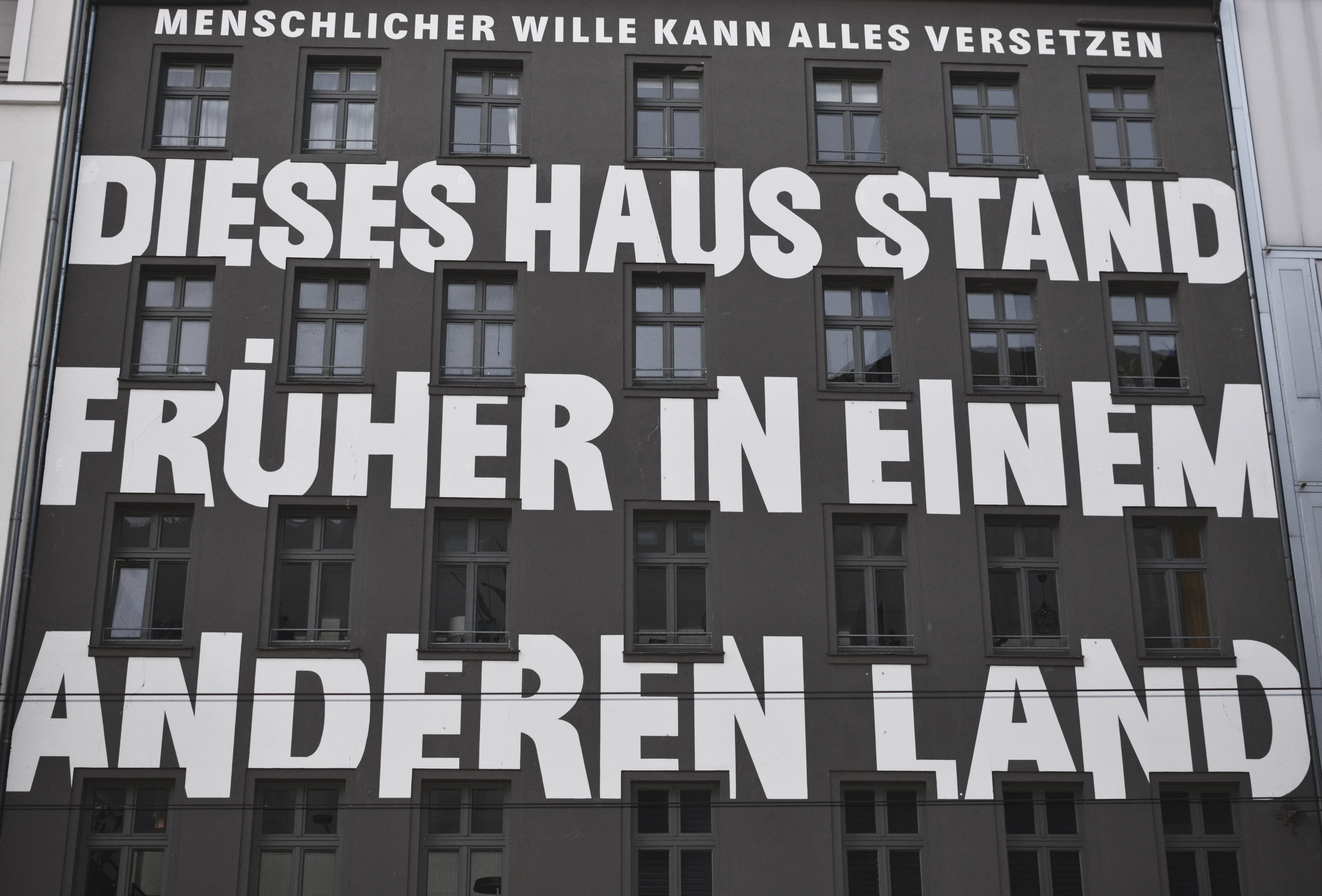
© Yevheniia Shyrchenko, Fachhochschule Potsdam, 2023
Just a few meters from this building, Berlin was divided into two parts by the Wall until 1989. This typographical object is one of the most famous memorials for German reunification. The artist chose a very bold neo-grotesque font for this typography sign, which draws the viewer’s attention and raises awareness of Berlin’s history.
